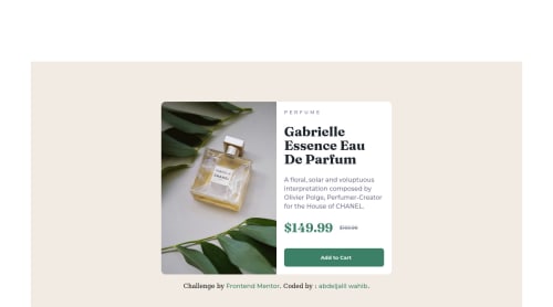
Responsive product preview card using flexbox

Solution retrospective
this challenge was relatively easy to tackle , I tried to respect the spacings as much as I could, however I do have some areas of code that I'm unsure of, for example the way I centered the product card I would much appreciate some feedback on that.
Please log in to post a comment
Log in with GitHubCommunity feedback
- @AdrianoEscarabote
Hi Abdeljalil wahib, how are you?
I really liked the result of your project, but I have some tips that I think you will like:
1- Every page should have one main landmark
<main>. So replace the div that wraps the whole content with<main>to improve the accessibility. click here2- All page content should be contained by landmarks, you can understand better by clicking here: click here
We have to make sure that all content is contained in a reference region, designated with HTML5 reference elements or ARIA reference regions.
Example:
native HTML5 reference elements:
<body>
    <header>This is the header</header>
    <nav>This is the nav</nav>
    <main>This is the main</main>
    <footer>This is the footer</footer>
</body>
ARIA best practices call for using native HTML5 reference elements instead of ARIA functions whenever possible, but the markup in the following example works:
<body>
     <div role="banner">This is the header</div>
     <div role="navigation">This is the nav</div>
     <div role="main">This is the main</div>
     <div role="contentinfo">This is the footer</div>
</body>
It is a best practice to contain all content, except skip links, in distinct regions such as header, navigation, main, and footer.
Link to read more about: click here
2- Why it Matters
Navigating the web page is far simpler for screen reader users if all of the content splits between one or more high-level sections. Content outside of these sections is difficult to find, and its purpose may be unclear.
HTML has historically lacked some key semantic markers, such as the ability to designate sections of the page as the header, navigation, main content, and footer. Using both HTML5 elements and ARIA landmarks in the same element is considered a best practice, but the future will favor HTML regions as browser support increases.
Rule Description
It is a best practice to ensure that there is only one main landmark to navigate to the primary content of the page and that if the page contains iframe elements, each should either contain no landmarks, or just a single landmark.
Link to read more about: click here
Prefer to use
removerpxto have your page working better across browsers and resizing the elements properlyThe rest is great!!
Hope it helps...👍
Marked as helpful - Account deleted
Hey @Ajwahib95, great job on this project!
Some suggestions to improve you code:
- While having interactive content (cards, links, icons, buttons, etc…) can definitely make content less static, if not done properly, it can actually have negative effect on your users experience. By simply just applying a “hover” effect to your content, you’re assuming that every device is compatible with “hover” effects. Unfortunately, most devices are not. To provide your users a better experience, you can use the @media (hover: hover) . Now users that that are devices that are not “hover” compatible will be able to enjoy your content.
Sources:
https://css-tricks.com/solving-sticky-hover-states-with-media-hover-hover/
- To make you content accessible to your users, it is a best to use rem/em instead of px for your CSS property values. For media queries, I definitely suggest using em for them. By using px your assuming that every users browser (mobile, tablet, laptop/desktop) is using a font size of 16px (this is the default size on browser). Em's will help with users whose default isn't 16px, which can sometimes cause the your content to overflow and negatively affect your layout.
Sources:
https://betterprogramming.pub/px-em-or-rem-examining-media-query-units-in-2021-e00cf37b91a9
Happy Coding!
Marked as helpful - @correlucas
👾Hello @Ajwahib95, Congratulations on completing this challenge!
Your solution its almost done and I’ve some tips to help you to improve it:
1.You've done the design for the wrong image, when you download the starter files the folder comes with 3 files (preview card, desktop and mobile) you've created the solution based on the
previewand you should consider only themobile + desktop images.Remove the
background-colorfrom the container and add it to thebodyto make sure this color background will display it full screen.2.Using
<picture>you’ve more control over the elements and its better than using the product image as<img>orbackground-image. Look that for SEO and search engine reasons it isn't a better practice to import this product image with CSS since this will make it harder to the image. You can manage both images inside the<picture>tag and use the html to code to set when the images should change setting the devicemax-widthdepending of the device (phone / computer) Here’s a guide about how to usepicture:https://www.w3schools.com/tags/tag_picture.aspSee the example below:
<picture>
  <source media="(max-width:650px)" srcset="./images/image-product-mobile.jpg">
  <img src="./images/image-product-desktop.jpg" alt="Gabrielle Parfum" style="width:auto;">
</picture>
✌️ I hope this helps you and happy coding!
Marked as helpful - @Absorberend
Hey man, looking good!
In terms of centering the product card I changed the following:
body{
  background-color: hsl(30, 38%, 92%);
  margin: 0;
  width: 100%;
  height: 100vh;
  display: flex;
  align-items: center;
  justify-content: center;
}
I also noticed the mobile design wasn't working properly because of the media query, so I changed that to:
@media (max-width: 600px)Basically what I did was I removed the margin on the body and gave the body 100% width and height 100vh instead. Just so the body covers the whole page (which is needed to center a div). After that I gave it the display of flex and made it so that the content would be centered vertically with
align-items: centerand horizontally withjustify-content: center. I hope this helps!Marked as helpful


Join our Discord community
Join thousands of Frontend Mentor community members taking the challenges, sharing resources, helping each other, and chatting about all things front-end!
Join our Discord