Skip to content
  • Unlock Pro
  • Log in with GitHub
Solution
Submitted about 1 year ago

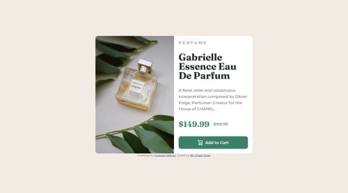
Responsive product preview card using flexbox

mkhantk•200
@mkhantk
A solution to the Product preview card component challenge
View live sitePreview (opens in new tab)View codeCode (opens in new tab)

Solution retrospective


What are you most proud of, and what would you do differently next time?

It doesn't take much time like the last one. Sort of improvement.

What challenges did you encounter, and how did you overcome them?

It all went well. Another practical experience.

What specific areas of your project would you like help with?

Any suggestions? Thanks.

Code
Select a file

Please log in to post a comment

Log in with GitHub

Community feedback

  • Abdul Khaliq 🚀•72,380
    @0xabdulkhaliq
    Posted about 1 year ago

    Hello there 👋. Congratulations on successfully completing the challenge! 🎉

    • I have a suggestion regarding your code that I believe will be of great interest to you.

    PiCTURE TAG 📸:

    • Looks like you're currently using media queries for swapping different version of image,
    <img src="images/image-product-desktop.jpg" alt="product-image-desktop" class="image1">
    <img src="images/image-product-mobile.jpg" alt="product-image-mobile" class="image2">
    
    .image1 {
      width: 100%;
      border-top-left-radius: 10px;
      border-bottom-left-radius: 10px;
      min-width: 50%;
    }
    .image2 {
      display: none;
    }
    
    @media (max-width: 600px) {
      .image1 {
        display: none;
      }
      .image2 {
        display: block;
        width: 100%;
        border-top-right-radius: 10px;
        border-top-left-radius: 10px;
      }
    }
    
    • So let me introduce the picture element. It's commonly used for responsive images, where different image sources are provided for different screen sizes and devices, and for art direction, where different images are used for different contexts or layouts.

    • Example:
    <picture>
      <source media="(max-width: 768px)" srcset="small-image.jpg">
      <source media="(min-width: 769px)" srcset="large-image.jpg">
      <img src="fallback-image.jpg" alt="Example image">
    </picture>
    

    • In this example, the <picture> tag contains three child elements: two <source> elements and an <img> element. The <source> elements specifies different image sources and the conditions under which they should be used.

    • Using this approach allows you to provide different images for different screen sizes without relying on CSS, and it also helps to improve page load times by reducing the size of the images that are served to the user

    • If you have any questions or need further clarification, you can always check out my submission and/or feel free to reach out to me.

    .

    I hope you find this helpful 😄 Above all, the solution you submitted is great !

    Happy coding!

    Marked as helpful
  • Akib Raza•900
    @akibraza91
    Posted about 1 year ago

    Hello there!

    Congrats on completing the challenge! ✅

    Your solution is really impressive!

    I've got a couple of ideas (about how to use HTML better) that could make it even stronger:

    Think about using <main> to wrap your main content instead of <div>.

    Imagine <div> and <span> in HTML as basic containers. They're good for holding stuff, but they don't tell us much about what's inside or its purpose on the webpage.

    These tweaks might not change how your page looks, but they'll make your HTML code clearer and help with SEO and accessibility.

    Hope that's helpful!

    Keep up the great work!

    Marked as helpful

Join our Discord community

Join thousands of Frontend Mentor community members taking the challenges, sharing resources, helping each other, and chatting about all things front-end!

Join our Discord
Frontend Mentor logo

Stay up to datewith new challenges, featured solutions, selected articles, and our latest news

Frontend Mentor

  • Unlock Pro
  • Contact us
  • FAQs
  • Become a partner

Explore

  • Learning paths
  • Challenges
  • Solutions
  • Articles

Community

  • Discord
  • Guidelines

For companies

  • Hire developers
  • Train developers
© Frontend Mentor 2019 - 2025
  • Terms
  • Cookie Policy
  • Privacy Policy
  • License

Oops! 😬

You need to be logged in before you can do that.

Log in with GitHub

Oops! 😬

You need to be logged in before you can do that.

Log in with GitHub

How does the accessibility report work?

When a solution is submitted, we use axe-core to run an automated audit of your code.

This picks out common accessibility issues like not using semantic HTML and not having proper heading hierarchies, among others.

This automated audit is fairly surface level, so we encourage to you review the project and code in more detail with accessibility best practices in mind.

How does the CSS report work?

When a solution is submitted, we use stylelint to run an automated check on the CSS code.

We've added some of our own linting rules based on recommended best practices. These rules are prefixed with frontend-mentor/ which you'll see at the top of each issue in the report.

The report will audit all CSS, SCSS and Less files in your repository.

How does the HTML validation report work?

When a solution is submitted, we use html-validate to run an automated check on the HTML code.

The report picks out common HTML issues such as not using headings within section elements and incorrect nesting of elements, among others.

Note that the report can pick up “invalid” attributes, which some frameworks automatically add to the HTML. These attributes are crucial for how the frameworks function, although they’re technically not valid HTML. As such, some projects can show up with many HTML validation errors, which are benign and are a necessary part of the framework.

How does the JavaScript validation report work?

When a solution is submitted, we use eslint to run an automated check on the JavaScript code.

The report picks out common JavaScript issues such as not using semicolons and using var instead of let or const, among others.

The report will audit all JS and JSX files in your repository. We currently do not support Typescript or other frontend frameworks.

Oops! 😬

You need to be logged in before you can do that.

Log in with GitHub

Oops! 😬

You need to be logged in before you can do that.

Log in with GitHub