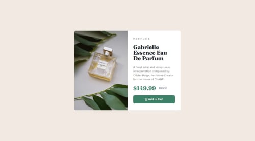
Submitted 8 months agoA solution to the Product preview card component challenge
Responsive product preview card using Flexbox

P
@mpujazon
Solution retrospective
What are you most proud of, and what would you do differently next time?
I’m proud to have used em and rem units for the first time — I think I’m finally getting it.
In the desktop version, I had an issue with the image showing white lines on the top and bottom, but I fixed it using max-height.
When I use the code below to center the container/card, I run into an issue on smaller screens (like an iPhone SE). The card doesn't display properly — it's cut off at the top.
body{
  width: 100vw;
  height: 100vh;
  display: flex;
  flex-direction: column;
  justify-content: center;
  align-items: center;
}
Code
Loading...
Please log in to post a comment
Log in with GitHubCommunity feedback
No feedback yet. Be the first to give feedback on mpujazon's solution.
Join our Discord community
Join thousands of Frontend Mentor community members taking the challenges, sharing resources, helping each other, and chatting about all things front-end!
Join our Discord