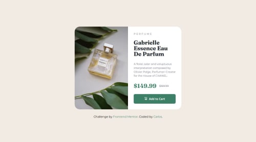
Responsive product preview card using Flexbox and CSS Grid

Solution retrospective
I’m proud of creating a clean and responsive product preview card using a mobile-first approach. I paid special attention to the semantic structure and accessibility. Next time, I would focus on implementing image optimization techniques like using the <picture> element for responsive images.
What challenges did you encounter, and how did you overcome them?One challenge was centering and aligning the product prices properly while keeping the markup clean. I solved it by using Flexbox to control the spacing and alignment within the price container. Another challenge was adjusting the layout between mobile and desktop views, which I overcame by applying media queries effectively.
What specific areas of your project would you like help with?I would like feedback on how to further optimize my CSS structure and better handle responsive images for different screen sizes using modern HTML techniques. Any suggestions on improving accessibility would also be appreciated.
Please log in to post a comment
Log in with GitHubCommunity feedback
No feedback yet. Be the first to give feedback on Carlos Alberto da Silva's solution.
Join our Discord community
Join thousands of Frontend Mentor community members taking the challenges, sharing resources, helping each other, and chatting about all things front-end!
Join our Discord