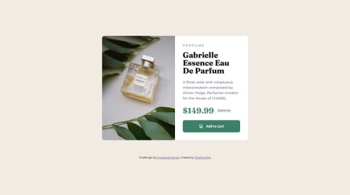
Responsive product preview card using Flexbox and CSS variables

Solution retrospective
I'm most proud of how clean and responsive the layout turned out across different screen sizes using only HTML and CSS. I structured the markup semantically and used modern CSS techniques like Flexbox and custom properties, which helped keep the code organized and scalable.
If I were to do this again, I would focus more on accessibility — including keyboard navigation and ARIA roles — and explore converting the component into a reusable React component to practice component-based development.
What challenges did you encounter, and how did you overcome them?One challenge I faced was ensuring the layout looked good on both desktop and mobile screens without breaking the design. I solved this by taking a mobile-first approach and using media queries to adjust the layout for larger screens. Another tricky part was handling the background image responsively — I used CSS background properties and different image files for mobile and desktop views to keep the design sharp and fast-loading.
What specific areas of your project would you like help with?I’d appreciate feedback on the accessibility of my component — especially regarding semantic HTML, alt text usage, and interactive elements like the button. I'm also interested in suggestions for optimizing my CSS structure or making it more reusable and scalable. If there are any best practices I missed for responsive design or performance, I'd love to hear them as well.
Please log in to post a comment
Log in with GitHubCommunity feedback
No feedback yet. Be the first to give feedback on Prashant Raj's solution.
Join our Discord community
Join thousands of Frontend Mentor community members taking the challenges, sharing resources, helping each other, and chatting about all things front-end!
Join our Discord