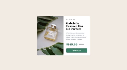
Responsive Product preview card using html and css

Solution retrospective
to do the responsiveness. need to improve a lot
What specific areas of your project would you like help with?always seeking guidance to improve
Please log in to post a comment
Log in with GitHubCommunity feedback
- @Obikaviola
Hi,
You really really did a great work here 💯
Your code is clean, well sectioned and things are where they should be.
I do have a few ideas on how to make it better.
I noticed that you put one image in the index.html file and the other on CSS.
There are ways to put both in the index.html file and that's through the picture tag.
Here are articles that might help you understand it better:
Also you don't need two media queries for the different screen sizes in this case. One is enough, that is for the bigger screen sizes because you build mobile first.
Also, right now, on the desktop view, the image seems to be cranked up. I'll suggest adding these code
img {
flex-basis: 50%;
}

section {
flex-basis: 50%;
}
This is like adding width to flex items.
Nice work once again 👍🏾
- @elistoyanova
well done!


Join our Discord community
Join thousands of Frontend Mentor community members taking the challenges, sharing resources, helping each other, and chatting about all things front-end!
Join our Discord