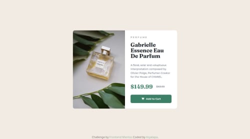
Submitted 9 months agoA solution to the Product preview card component challenge
Responsive Product Preview Card with CSS Flexbox, Media Queries

@Asyalapa
Solution retrospective
What challenges did you encounter, and how did you overcome them?
Initially, I added the image using the <img> tag, but this caused issues with responsiveness on mobile devices — the image didn’t scale properly and disrupted the layout. I had to move the image to a CSS background using background-size: cover. This allowed for better control over scaling and made it easier to adapt the design for different screen sizes.
This experience highlighted the importance of choosing the right approach for handling images in responsive designs.
Code
Loading...
Please log in to post a comment
Log in with GitHubCommunity feedback
No feedback yet. Be the first to give feedback on Anastasia's solution.
Join our Discord community
Join thousands of Frontend Mentor community members taking the challenges, sharing resources, helping each other, and chatting about all things front-end!
Join our Discord