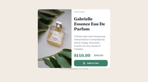
Responsive product preview card with Sass

Solution retrospective
I tried styling with Sass. On this project used only Sass variables, next time would like to try also nesting and mixing.
Card images for mobile and desktop view are added with CSS:
.card-image {
    content:url('images/image-product-mobile.jpg');
}
I used mobile first approach. This way mobile view responsiveness was easily achieved with flex-direction default styling.
.card {
  display: flex;
  flex-direction: column;
}
Most challenging for me was to make responsive the larger views, because the width varies in very wide scale. I tried to adjust card text area padding and text size with media queries but I´m not quite pleased with the final result.
What specific areas of your project would you like help with?There are so many different devices with different screen resolutions that people use? How to make the responsive component styling simpler? What tricks and tools to you use? I use Chrome DevTools to test the views.
Please log in to post a comment
Log in with GitHubCommunity feedback
No feedback yet. Be the first to give feedback on Mary2021's solution.
Join our Discord community
Join thousands of Frontend Mentor community members taking the challenges, sharing resources, helping each other, and chatting about all things front-end!
Join our Discord