Skip to content
  • Unlock Pro
  • Log in with GitHub
Solution
Submitted almost 3 years ago

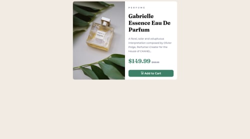
Responsive Product Preview (HTML/CSS)

Hugo•30
@hugocerezer
A solution to the Product preview card component challenge
View live sitePreview (opens in new tab)View codeCode (opens in new tab)
Code
Select a file

Please log in to post a comment

Log in with GitHub

Community feedback

  • Lucas 👾•104,160
    @correlucas
    Posted almost 3 years ago

    👾Hello @hugocerezer, Congratulations on completing this challenge!

    Your solution its almost done and I’ve some tips to help you to improve it:

    Fix the alignment of the whole content using flex and min-height to manage the vertical alignment and make everything centered.First of all put min-height: 100vh to the body to make the body display 100% of the viewport height (this makes the container align to the height size that's now 100% of the screen height) size and display: flex e flex-direction: column to align the child element (the container) vertically using the body as reference.

    body {
        min-height: 100vh;
        background-color: hsl(30, 38%, 92%);
        display: flex;
        align-items: center;
        justify-content: center;
        flex-direction: column;
    }
    

    A better way to work this solution image, the product image is by using <picture> to wrap it on the html instead of using it as <img> or background-image (with the css). Using <picture> you wrap both images (desktop and mobile) and have more control over it, since you can set in the html when the images changes setting the screen size for each image.ote that for SEO / search engine reasons isn’t a better practice import this product image with CSS since this will make it harder to the image.

    Here’s the documentation and the guide to use this tag: https://www.w3schools.com/tags/tag_picture.asp

    See the example below:

    <picture>
      <source media="(max-width:650px)" srcset="./images/image-product-mobile.jpg">
      <img src="./images/image-product-desktop.jpg" alt="Gabrielle Parfum" style="width:auto;">
    </picture>
    

    ✌️ I hope this helps you and happy coding!

    Marked as helpful
  • Wojtek Natkaniec•170
    @wojocode
    Posted almost 3 years ago

    Hi ! NIce work! One think you have to change, is aligned box vertically. You can do it many different ways. I usually use flex-box with row-direction and align-items:center or position:absolute; top:0; left:0; transform: translate(-50%,-50%); Cheers!

Join our Discord community

Join thousands of Frontend Mentor community members taking the challenges, sharing resources, helping each other, and chatting about all things front-end!

Join our Discord

Stay up to datewith new challenges, featured solutions, selected articles, and our latest news

Frontend Mentor

  • Unlock Pro
  • Contact us
  • FAQs
  • Become a partner

Explore

  • Learning paths
  • Challenges
  • Solutions
  • Articles

Community

  • Discord
  • Guidelines

For companies

  • Hire developers
  • Train developers
© Frontend Mentor 2019 - 2025
  • Terms
  • Cookie Policy
  • Privacy Policy
  • License

Oops! 😬

You need to be logged in before you can do that.

Log in with GitHub

Oops! 😬

You need to be logged in before you can do that.

Log in with GitHub

How does the accessibility report work?

When a solution is submitted, we use axe-core to run an automated audit of your code.

This picks out common accessibility issues like not using semantic HTML and not having proper heading hierarchies, among others.

This automated audit is fairly surface level, so we encourage to you review the project and code in more detail with accessibility best practices in mind.

How does the CSS report work?

When a solution is submitted, we use stylelint to run an automated check on the CSS code.

We've added some of our own linting rules based on recommended best practices. These rules are prefixed with frontend-mentor/ which you'll see at the top of each issue in the report.

The report will audit all CSS, SCSS and Less files in your repository.

How does the HTML validation report work?

When a solution is submitted, we use html-validate to run an automated check on the HTML code.

The report picks out common HTML issues such as not using headings within section elements and incorrect nesting of elements, among others.

Note that the report can pick up “invalid” attributes, which some frameworks automatically add to the HTML. These attributes are crucial for how the frameworks function, although they’re technically not valid HTML. As such, some projects can show up with many HTML validation errors, which are benign and are a necessary part of the framework.

How does the JavaScript validation report work?

When a solution is submitted, we use eslint to run an automated check on the JavaScript code.

The report picks out common JavaScript issues such as not using semicolons and using var instead of let or const, among others.

The report will audit all JS and JSX files in your repository. We currently do not support Typescript or other frontend frameworks.

Oops! 😬

You need to be logged in before you can do that.

Log in with GitHub

Oops! 😬

You need to be logged in before you can do that.

Log in with GitHub