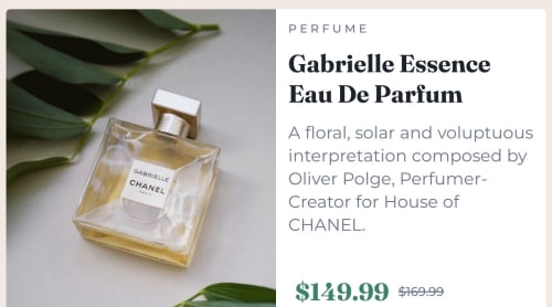
Responsive product preview using flexbox.

Solution retrospective
First time using media query for responsive. hope this help my skills and experience in responsive design before i going to learn about framework and advanced project.
What challenges did you encounter, and how did you overcome them?it's all about responsive. i tried to made it easy to read and understand in every device. also have a bit problem with flexbox width.
What specific areas of your project would you like help with?Can you advice me a framework for starter only html and css? i want to start learning about framwork now.
Please log in to post a comment
Log in with GitHubCommunity feedback
- P@MikDra1
If you want to make your card responsive with ease you can use this technique:
.card {
width: 90%;
max-width: 37.5rem;
}
On the smaller screens card will be 90% of the parent (here body), but as soon as the card will be 37.5rem (600px) it will lock with this size.
Also to put the card in the center I advise you to use this code snippet:
.container {
display: grid;
place-items: center;
}
Hope you found this comment helpful 💗💗💗
Good job and keep going 😁😊😉
Marked as helpful - @cjay44
Great first attempt mate! I would suggest that you look into the max-width properties. It will help ensuring that context doesn't get too big, especially on screens with large resolutions.
Happy coding!!
Marked as helpful


Join our Discord community
Join thousands of Frontend Mentor community members taking the challenges, sharing resources, helping each other, and chatting about all things front-end!
Join our Discord