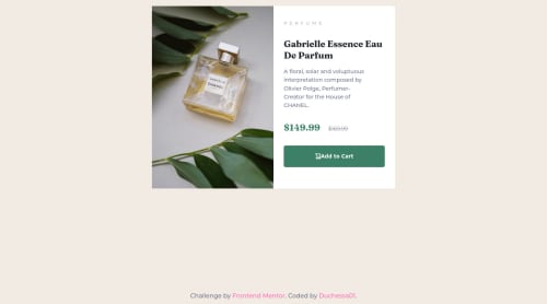
Responsive Product Preview using Grid

Solution retrospective
Hello! It was a funny challenge. I had problems using the <picture> tag, didn't use it, but still managed to get a result I love. All kinds of problems arised when I tried to center <main> with flexbox. Getting it pixel perfect as the guide image wasn't my point. The result? I left it as it was ahah :) I used one media query just to resize the picture height and I'm happy with it. What do you think? Any suggestions? Any ideas of things I could have done easier than I did?
Please log in to post a comment
Log in with GitHubCommunity feedback
- @mattari97
Hello Duchessa. Good job completing this challenge 🎉🎉🎉.
I see that you have good basics in front-end and the result is great.
I will try answer your questions to the best of my abilities and give you some small advises:
- First of all about the "centering". I think that you were really close to the solution because I can see that you already know about the
margin: autotrick with flexbox which worked on the inline axis (horizontal) already. However to make it work on the block axis you need to give a height (or in this case a min-height) to the body element.
the code would look something like this:
body {
    /* KEEP Previous styles ... */
    min-height: 100vh;
    display: flex;
    flex-direction: column;
    justify-content: center
}

main {
    /* REMOVE previous styles */
    margin: auto; /* Put the main in the center & push footer at the bottom */
    padding: 1rem;
    width: min(100%, 40rem);
}
You can remove every over
margin: autoin your css and allmax-width.Note: the property
width: min(100%, 40rem);is a shorthand forwidth: 100%; max-width: 40rem;- If you look closely, the border-radius is not "applied" to the image in the
.product-card. It happens because the image overflows its container and does not have a border-radius itself. Rather than giving it a border radius you can add the propertyoverflow: hiddento the.product-cardwhich will hide the sharp edges of the image that are "outside" of the section. - The image looks distorted when the screen's width is between 380px and 575px. To fix that add the property
object-fit: coverto the.product-imgclass. - I would suggest that you add a little transition on the "Add to cart" button for the hover effect. It could be something like this:
.add-to-cart {
    /* KEEP previous styles */
    transition: 300ms background-color linear;
}
You can play with the duration and the timing-function as you like until you find something that you like 👍
- And finally here is an example of a picture element from one of my solutions :
<picture>
    <source media="(max-width: 649px)" srcset="./src/assets/mobile/image-header.jpg" />
     <img
       class="header__image"
       src="./src/assets/desktop/image-header.jpg"
       srcset="./src/assets/desktop/image-header.jpg"
       alt="An orange sliced in half" />
</picture>
That's it. I hope it helps. Have a nice day/night and happy coding 😊
Marked as helpful - First of all about the "centering". I think that you were really close to the solution because I can see that you already know about the
- @correlucas
👾Hello @duchessa01, Congratulations on completing this challenge!
Your solution its almost done and I’ve some tips to help you to improve it:
Use the THE PICTURE TAG that is a shortcut to deal with the multiple images in this challenge. So you can use the
<picture>tag instead of importing this as an<img>or using a div withbackground-image. Use it to place the images and make the change between mobile and desktop, instead of using adivorimgand set the change in the css withdisplay: nonewith the tag picture is more practical and easy. Note that for SEO / search engine reasons isn’t a better practice import this product image with CSS since this will make it harder to the image. Manage both images inside the<picture>tag and use the html to code to set when the images should change setting the devicemax-widthdepending of the device desktop + mobile.Check the link for the official documentation for
<picture>in W3 SCHOOLS:https://www.w3schools.com/tags/tag_picture.aspSee the example below:
<picture> <source media="(max-width:650px)" srcset="./images/image-product-mobile.jpg"> <img src="./images/image-product-desktop.jpg" alt="Gabrielle Parfum" style="width:auto;"> </picture>👨💻Here's my solution for this challenge if you wants to see how I build it: https://www.frontendmentor.io/solutions/product-preview-card-vanilla-css-and-custom-hover-state-on-hero-85A1JsueD1
✌️ I hope this helps you and happy coding!


Join our Discord community
Join thousands of Frontend Mentor community members taking the challenges, sharing resources, helping each other, and chatting about all things front-end!
Join our Discord