Skip to content
  • Unlock Pro
  • Log in with GitHub
Solution
Submitted almost 3 years ago

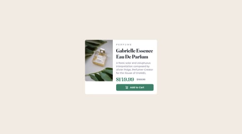
responsive product preview with tailwindcss

tailwind-css
Hadjer Laissaoui•160
@HadjerL
A solution to the Product preview card component challenge
View live sitePreview (opens in new tab)View codeCode (opens in new tab)

Solution retrospective


Hello everyone, I have finished this challenge. I have learned a lot still have some issues though. This was my first using tailwind-css. I'm still not quite used to it, but I liked the experience.

Here are some things I found difficult building the project:

  • Knowing what are the right sized to use.
  • Working on the image element.
  • Organizing my work.

How I think I can solve this:

  • I tried playing with numbers as someone here advised me too, I will to search for how these sizes are chosen and understand css unit more, maybe that will help, I would appreciate any recommandations though.
  • I need to study images behavior to understand how to deal with in the future, and I'm still having the problem on the desktop design, I would love if anyone could help me with that.
  • As for organization, I have to practice more, maybe watch how more experienced people work.

My question:

  • Could you provide me with feedback of what I have done so far?
  • Could you give any suggestions for the issued precited?
  • What do you think is the best practice for a beginner ?
  • I have seen that writing a good readme file is so important. I searched few guides, but I want to know more about that.
Code
Loading...

Please log in to post a comment

Log in with GitHub

Community feedback

  • Lucas 👾•104,160
    @correlucas
    Posted almost 3 years ago

    👾Hello @HadjerL, congratulations for your new solution!

    Answering your question:

    To build this solution I choose grid because I think is more appropriate and its easier, I ever chose grid for layout and flex to small components and organizate elements. All you need to do is create a main block to hold all the content (you can use <main> to wrap), set its width as max-width: 1000px (it's the container size) and display: grid / grid-template-column: 1fr 1fr(this means that your component will have two columns with 50% of the container width each thats 500px). To make your image fully responsive add display: blockand max-width: 100% and object-fit: cover to make the image auto-crop when resizing inside the column:

    img {
        display: block;
        object-fit: cover;
        max-width: 100%;
    }
    

    👨‍💻Here's my solution for this challenge if you wants to see how I build it: https://www.frontendmentor.io/solutions/product-preview-card-vanilla-css-and-custom-hover-state-on-hero-85A1JsueD1

    👋 I hope this helps you and happy coding!

    Marked as helpful

Join our Discord community

Join thousands of Frontend Mentor community members taking the challenges, sharing resources, helping each other, and chatting about all things front-end!

Join our Discord
Frontend Mentor logo

Stay up to datewith new challenges, featured solutions, selected articles, and our latest news

Frontend Mentor

  • Unlock Pro
  • Contact us
  • FAQs
  • Become a partner

Explore

  • Learning paths
  • Challenges
  • Solutions
  • Articles

Community

  • Discord
  • Guidelines

For companies

  • Hire developers
  • Train developers
© Frontend Mentor 2019 - 2025
  • Terms
  • Cookie Policy
  • Privacy Policy
  • License

Oops! 😬

You need to be logged in before you can do that.

Log in with GitHub

Oops! 😬

You need to be logged in before you can do that.

Log in with GitHub

How does the accessibility report work?

When a solution is submitted, we use axe-core to run an automated audit of your code.

This picks out common accessibility issues like not using semantic HTML and not having proper heading hierarchies, among others.

This automated audit is fairly surface level, so we encourage to you review the project and code in more detail with accessibility best practices in mind.

How does the CSS report work?

When a solution is submitted, we use stylelint to run an automated check on the CSS code.

We've added some of our own linting rules based on recommended best practices. These rules are prefixed with frontend-mentor/ which you'll see at the top of each issue in the report.

The report will audit all CSS, SCSS and Less files in your repository.

How does the HTML validation report work?

When a solution is submitted, we use html-validate to run an automated check on the HTML code.

The report picks out common HTML issues such as not using headings within section elements and incorrect nesting of elements, among others.

Note that the report can pick up “invalid” attributes, which some frameworks automatically add to the HTML. These attributes are crucial for how the frameworks function, although they’re technically not valid HTML. As such, some projects can show up with many HTML validation errors, which are benign and are a necessary part of the framework.

How does the JavaScript validation report work?

When a solution is submitted, we use eslint to run an automated check on the JavaScript code.

The report picks out common JavaScript issues such as not using semicolons and using var instead of let or const, among others.

The report will audit all JS and JSX files in your repository. We currently do not support Typescript or other frontend frameworks.

Oops! 😬

You need to be logged in before you can do that.

Log in with GitHub