


@correlucas
Posted
👾Hello Danii, Congratulations on completing this challenge!
Your solution its almost done and I’ve some tips to help you to improve it:
1.Fix the alignment of the whole content using flex and min-height to manage the vertical alignment and make everything centered.First of all put min-height: 100vh to the body to make the body display 100% of the viewport height (this makes the container align to the height size that's now 100% of the screen height) size and display: flex e flex-direction: column to align the child element (the container) vertically using the body as reference.
body {
    min-height: 100vh;
    background-color: var(--cream);
    font-family: 'Fraunces', serif;
    font-family: 'Montserrat', sans-serif;
    display: flex;
    flex-direction: column;
    align-items: center;
    justify-content: center;
}
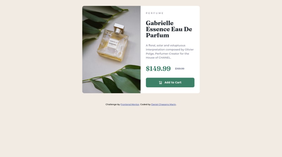
2.A better way to work this solution image, the product image is by using <picture> to wrap it on the html instead of using it as <img> or background-image (with the css). Using <picture> you wrap both images (desktop and mobile) and have more control over it, since you can set in the html when the images changes setting the screen size for each image.ote that for SEO / search engine reasons isn’t a better practice import this product image with CSS since this will make it harder to the image.
Here’s the documentation and the guide to use this tag:
https://www.w3schools.com/tags/tag_picture.asp
See the example below:
<picture>
  <source media="(max-width:650px)" srcset="./images/image-product-mobile.jpg">
  <img src="./images/image-product-desktop.jpg" alt="Gabrielle Parfum" style="width:auto;">
</picture>
👨💻Here's my solution for this challenge if you wants to see how I build it: https://www.frontendmentor.io/solutions/product-preview-card-vanilla-css-and-custom-hover-state-on-hero-85A1JsueD1
✌️ I hope this helps you and happy coding!

