Skip to content
  • Unlock Pro
  • Log in with GitHub
Solution
Submitted almost 2 years ago

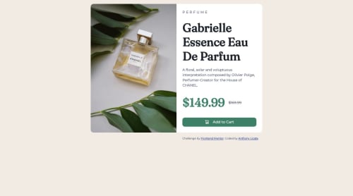
Responsive Product Review Card CSS

Anthony Licata•170
@anthonyplicata
A solution to the Product preview card component challenge
View live sitePreview (opens in new tab)View codeCode (opens in new tab)

Solution retrospective


I used this challenge as more of a learning challenge. There were new concepts in here, and I wanted to learn better practices based on a professional. I watched Kevin Powell as a guide, and it was incredibly helpful. I feel much more confident in my markup now. I learned to create a responsive webpage for mobile and desktop using flexbox and grid. Using <picture> is a great tool to add multiple img files that can be used for different screen sizes. I learned better ways of organizing elements too.

This challenge tested me quite a bit with figuring out how to make it responsive. I realize that vertical and horizontal card are the same and it depends on the width of the screen and the max-width you set. I spent quite a bit of time trying to make two separate "cubes" to put next to each other, but I learned quickly they did not maintain interaction how I intended.

I'm still struggling with bringing the contents into the center of the page. For the last challenge I was given helpful advice of removing padding and margin to utilize the flexbox potential. It worked for that one, but for this challenge I could not figure it out.

I would love some advice on that.

Edit: With some helpful advice (a reminder as well) I got it centered! Should stick in my head this time.

Code
Select a file

Please log in to post a comment

Log in with GitHub

Community feedback

  • thecavydev•510
    @okeke-ugochukwu
    Posted almost 2 years ago

    Hi Anthony, you're doing really really great!

    Your elements are centered quite alright. The height of your body tag is snapped to the total height of it's content, making the entire page look like it's not centered.

    Give it a min-height of 100vh and you're good

    Marked as helpful
  • Boots 😺•1,610
    @adityaphasu
    Posted almost 2 years ago

    Hi!

    Nicely done!! The markup is actually pretty nice 👌🏻

    You have actually pretty much used everything right to center the content except you are missing min-height:100vh on the body! whether flexbox or grid the element needs a height for the content to be vertically center of, hence we use min-height:100vh so that the content gets centered on the page.

    After adding min-height:100vh on the body the content should be in the center!

    Keep up the hard work and happy coding!😊

    Marked as helpful

Join our Discord community

Join thousands of Frontend Mentor community members taking the challenges, sharing resources, helping each other, and chatting about all things front-end!

Join our Discord
Frontend Mentor logo

Stay up to datewith new challenges, featured solutions, selected articles, and our latest news

Frontend Mentor

  • Unlock Pro
  • Contact us
  • FAQs
  • Become a partner

Explore

  • Learning paths
  • Challenges
  • Solutions
  • Articles

Community

  • Discord
  • Guidelines

For companies

  • Hire developers
  • Train developers
© Frontend Mentor 2019 - 2025
  • Terms
  • Cookie Policy
  • Privacy Policy
  • License

Oops! 😬

You need to be logged in before you can do that.

Log in with GitHub

Oops! 😬

You need to be logged in before you can do that.

Log in with GitHub

How does the accessibility report work?

When a solution is submitted, we use axe-core to run an automated audit of your code.

This picks out common accessibility issues like not using semantic HTML and not having proper heading hierarchies, among others.

This automated audit is fairly surface level, so we encourage to you review the project and code in more detail with accessibility best practices in mind.

How does the CSS report work?

When a solution is submitted, we use stylelint to run an automated check on the CSS code.

We've added some of our own linting rules based on recommended best practices. These rules are prefixed with frontend-mentor/ which you'll see at the top of each issue in the report.

The report will audit 1st-party linked stylesheets, and styles within <style> tags.

How does the HTML validation report work?

When a solution is submitted, we use html-validate to run an automated check on the HTML code.

The report picks out common HTML issues such as not using headings within section elements and incorrect nesting of elements, among others.

Note that the report can pick up “invalid” attributes, which some frameworks automatically add to the HTML. These attributes are crucial for how the frameworks function, although they’re technically not valid HTML. As such, some projects can show up with many HTML validation errors, which are benign and are a necessary part of the framework.

Oops! 😬

You need to be logged in before you can do that.

Log in with GitHub

Oops! 😬

You need to be logged in before you can do that.

Log in with GitHub