


@correlucas
Posted
👾Hello @sof28, Congratulations on completing this challenge!
Your solution its almost done and I’ve some tips to help you to improve it:
1.Replace the <h3> containing the main title with <h1> note that this title is the main heading for this page and every page needs one h1 to show which is the most important heading. Use the sequence h1 h2 h3 h4 h5 to show the hierarchy of your titles in the level of importance, never jump a level.
2.Add the correct font for the main heading of this component. First of all you need to choose the font using Google Fonts https://fonts.google.com/ and import the code to drop on your CSS/HTML:
This is the font for the H1: font-family: 'Fraunces', serif;. There's two ways to import the font:
- Using the html and inserting it to the
<head>
<head>
<link rel="preconnect" href="https://fonts.googleapis.com">
<link rel="preconnect" href="https://fonts.gstatic.com" crossorigin>
<link href="https://fonts.googleapis.com/css2?family=Fraunces:opsz,[email protected],700&display=swap" rel="stylesheet">
</head>
- Using the CSS and adding to the first line of the CSS sheet:
@import url('https://fonts.googleapis.com/css2?family=Fraunces:opsz,[email protected],700&display=swap');
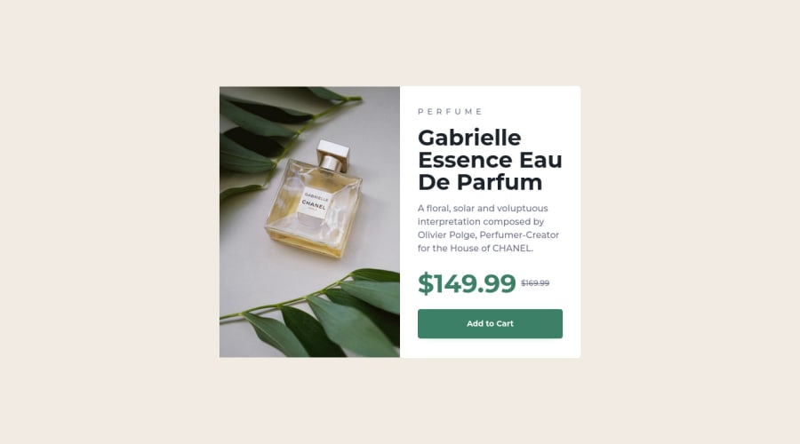
3.A better way to work this solution image, the product image is by using <picture> to wrap it on the html instead of using it as <img> or background-image (with the css). Using <picture> you wrap both images (desktop and mobile) and have more control over it, since you can set in the html when the images changes setting the screen size for each image.ote that for SEO / search engine reasons isn’t a better practice import this product image with CSS since this will make it harder to the image.
Here’s the documentation and the guide to use this tag:
https://www.w3schools.com/tags/tag_picture.asp
See the example below:
<picture>
  <source media="(max-width:650px)" srcset="./images/image-product-mobile.jpg">
  <img src="./images/image-product-desktop.jpg" alt="Gabrielle Parfum" style="width:auto;">
</picture>
✌️ I hope this helps you and happy coding!
Marked as helpful
@sof28
Posted
@correlucas thank you very much for the tips, they are very helpful and I'm going to make the changes ,you suggested.
I really appreciated it and happy coding also to you !!

