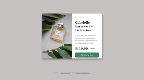
Responsive product-preview-card-component using CSS Flexbox

Solution retrospective
As I attempting this challenge I discovered that I had to display different images basing on a screen specific screen size and am inquiring for the best way to approach this issue with HTML because I used CSS, by hiding one image and displaying the other at a certain media screen and I believe this is not efficient for it makes users with small screen sizes fetch big desktop images cause they still do exist in the DOM which wastes bandwidth.
Please log in to post a comment
Log in with GitHubCommunity feedback
- @md5dalton
Hello ssembatya-dennis 👋
If you want to implement responsive images in your app,
pictureHTML element is the best choice to go with. You can use it load appropriate images depending on the device screen size. Here's how you can use it in your app:<picture> <source srcset="/images/image-product-desktop.jpg" media="(min-width: 576px)" /> <img src="/images/image-product-mobile.jpg" alt="transparent perfume bottle" /> </picture>I hope that helps. 👌
Marked as helpful

Join our Discord community
Join thousands of Frontend Mentor community members taking the challenges, sharing resources, helping each other, and chatting about all things front-end!
Join our Discord