


Rio Cantre• 9,710
@RioCantre
Posted
Hello there! Good job with this one. Viewing your solution, I would suggest the following for you...
- Add these properties inside the
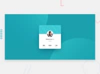
bodytagbackground-position: center center;andbackground-size: cover; - Create a new rule set called
mainand add this properties...
main {
  width: 400px;
  height: 400px;
  display: flex;
  flex-direction: column;
  align-items: center;
  margin: auto;
}
- Remove the width and height in the
.profile-cardand addpadding-bottom: 1.5rem; - Add
margin-bottom: 1rem;in the rule set of.info h3.head-3 - Adjust the properties in the media queries
- Instead of
h5alternative ish4 - Add color value to
hrwithcolor: hsla(223, 10%, 83%, 0.79);
Hope this helps and Keep it up!
Marked as helpful
1
Buddhadeb Chhetri• 110
@Buddhad
Posted
@RioCantre Thanks you bro for the suggestions It was really helpful.
1
