Submitted over 2 years agoA solution to the Profile card component challenge
responsive Profile card component

@syybiekarim
Solution retrospective
i know i did stuff wrong here can yall please tell me i also have some questions :
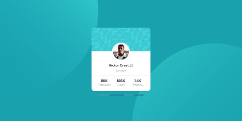
- how can i have the background image ( the small blue one behind the profile pic ) skip the profile image border like the challenge has? i tried margin and padding but it didnt work
- I STRUGELD a lot to get that background image to that place on top left but i never figured how to have 2 background images like the one in the challenges so i can put 1 in top left and the other one in the bottom right?
- why is there a big vertical space between the profile image and h1 out of nowhere (i had to add negative 2rem to fix this weird problem)
- why border radius on the main tag doesnt do anything even tho it contain all the card
- i used hr tag for the line how can i make it lighter?
Code
Please log in to post a comment
Log in with GitHubCommunity feedback
- @seangray-dev
Hey there, nice job on this challenge. I got a couple suggestions that may help 😁.
- To answer your first question you could try something like this on your profile pic:
#profile-pic { border: 5px solid white; }- You can add multiple background images by separating them with a comma, and same with the positioning.
body { background-image: url(...), url(...); background-position: top left, bottom right; }-
By default heading elements come with a default margin property to them. I personally reset a lot of my CSS, which you can check this here to avoid this issue in the future: https://gist.github.com/Asjas/4b0736108d56197fce0ec9068145b421
-
Instead of using the hr tag you could use a border top or bottom to one of the other elements.
section#second-section {
border-top: 1px solid hsl(0, 0%, 59%);
}
Hope this helps! Keep it up and good luck 😁
Marked as helpful

Join our Discord community
Join thousands of Frontend Mentor community members taking the challenges, sharing resources, helping each other, and chatting about all things front-end!
Join our Discord