Skip to content
  • Unlock Pro
  • Log in with GitHub
Solution
Submitted over 2 years ago

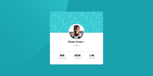
Responsive Profile Card using HTML & CSS

Muralidhara Bhat KS•90
@SlenderShield
A solution to the Profile card component challenge
View live sitePreview (opens in new tab)View codeCode (opens in new tab)

Solution retrospective


How can i improve the positioning in CSS? I get confused when it comes to positioning in CSS, is there any way to reduce it?
What is the best practices for positioning and responsiveness?

Code
Couldn’t fetch repository

Please log in to post a comment

Log in with GitHub

Community feedback

  • Melvin Aguilar 🧑🏻‍💻•61,020
    @MelvinAguilar
    Posted over 2 years ago

    Hi @SlenderShield 👋, good job on completing this challenge! 🎉

    Here are some suggestions you might consider:

    • Centering the element with position would make your element behave strangely on some mobile devices. Therefore, it's better to use more modern methods of positioning elements, like flexbox or grid:

    Using flexbox layout:

    body {
       width: 100%;
       min-height: 100vh;
       display: flex;
       flex-direction: column;
       justify-content: center;
       align-items: center;
    }
    

    Using grid layout:

    body {
       width: 100%;
       min-height: 100vh;
       display: grid;
       place-content: center;
    }
    

    Additionally, remove the position properties to center the card correctly.

    .wrapper {
        display: flex;
        justify-content: center;
        /* position: absolute; */
        /* top: 50%; */
        /* left: 50%; */
        /* transform: translate(-50%, -50%); */
    }
    

    Links with more information:

    • The Complete Guide to Centering in CSS.
    • A Complete Guide to Flexbox (CSS-Tricks).
    • How TO - Center Elements Vertically (W3Schools).
    • CSS Layout - Horizontal & Vertical Align (W3Schools).

    .

    • You can use CSS background properties directly on your body element to set the background:
    body {
        . . .
        background-color: hsl(185, 75%, 39%);
        background-image: url(./images/bg-pattern-top.svg), url(./images/bg-pattern-bottom.svg);
        background-repeat: no-repeat, no-repeat;
        background-position: right 52vw bottom 35vh, left 48vw top 52vh;
    }
    
    • background-color Set the background color
    • background-image Set a background image
    • background-repeat Sets if a background image will be repeated along the horizontal and vertical axes, or not repeated at all.
    • background-position Sets the starting position of a background image. More information
    • You can also specify the size of the background image with background-size

    The background property is shorthand for all the properties mentioned above but for now. It is better to understand them separately.

    The background-position for me worked with the vw (viewport width) and vh (viewport height) units, but you can also use percentages. It's just a matter of trial and error to place them as you wish.

    References:

    1. CSS background Property
    2. Background property
    3. Background-repeat (MDN)

    I hope those tips will help you.

    Good job, and happy coding!

    Marked as helpful

Join our Discord community

Join thousands of Frontend Mentor community members taking the challenges, sharing resources, helping each other, and chatting about all things front-end!

Join our Discord
Frontend Mentor logo

Stay up to datewith new challenges, featured solutions, selected articles, and our latest news

Frontend Mentor

  • Unlock Pro
  • Contact us
  • FAQs
  • Become a partner

Explore

  • Learning paths
  • Challenges
  • Solutions
  • Articles

Community

  • Discord
  • Guidelines

For companies

  • Hire developers
  • Train developers
© Frontend Mentor 2019 - 2025
  • Terms
  • Cookie Policy
  • Privacy Policy
  • License

Oops! 😬

You need to be logged in before you can do that.

Log in with GitHub

Oops! 😬

You need to be logged in before you can do that.

Log in with GitHub

How does the accessibility report work?

When a solution is submitted, we use axe-core to run an automated audit of your code.

This picks out common accessibility issues like not using semantic HTML and not having proper heading hierarchies, among others.

This automated audit is fairly surface level, so we encourage to you review the project and code in more detail with accessibility best practices in mind.

How does the CSS report work?

When a solution is submitted, we use stylelint to run an automated check on the CSS code.

We've added some of our own linting rules based on recommended best practices. These rules are prefixed with frontend-mentor/ which you'll see at the top of each issue in the report.

The report will audit 1st-party linked stylesheets, and styles within <style> tags.

How does the HTML validation report work?

When a solution is submitted, we use html-validate to run an automated check on the HTML code.

The report picks out common HTML issues such as not using headings within section elements and incorrect nesting of elements, among others.

Note that the report can pick up “invalid” attributes, which some frameworks automatically add to the HTML. These attributes are crucial for how the frameworks function, although they’re technically not valid HTML. As such, some projects can show up with many HTML validation errors, which are benign and are a necessary part of the framework.

Oops! 😬

You need to be logged in before you can do that.

Log in with GitHub