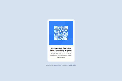
Responsive QR code card using Flexbox and CSS Variables

Solution retrospective
I'm proud of having structured a clean, semantic HTML layout and achieving a pixel-perfect match to the original design. Next time, I’d like to improve my shorthand use for margin and padding and explore using clamp() or other responsive units for typography.
What challenges did you encounter, and how did you overcome them?I had trouble at first understanding how the margin shorthand works with three values. I researched how the CSS margin shorthand logic applies (top | horizontal | bottom) and practiced applying it correctly to avoid unnecessary repetition.
What specific areas of your project would you like help with?I’d appreciate feedback on my use of margin and padding shorthand. Also, suggestions on improving the responsiveness and optimizing the layout with modern CSS techniques like min(), max(), or clamp() would be great.
Please log in to post a comment
Log in with GitHubCommunity feedback
- @Iamsahilroy
..
Join our Discord community
Join thousands of Frontend Mentor community members taking the challenges, sharing resources, helping each other, and chatting about all things front-end!
Join our Discord