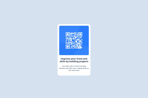
Responsive QR Code Card with Pure HTML & CSS

Solution retrospective
What I'm most proud of is how I managed to fully center the component both vertically and horizontally using pure CSS, without relying on any frameworks. I also paid attention to detail by closely matching the design, ensuring clean typography, spacing, and mobile responsiveness.
What I would do differently next time is focus more on accessibility and responsiveness. I would add alt text that is more descriptive, use semantic HTML tags like <figure> or <article> where appropriate, and test on multiple screen sizes. I’d also consider using a mobile-first approach from the start, and maybe explore adding transitions or animations for interactivity.
What challenges did you encounter, and how did you overcome them?One of the main challenges I encountered was centering the QR code card both vertically and horizontally on the page using only HTML and CSS. Initially, I tried using margin and padding, but the layout wasn’t consistent across different screen sizes. After researching and experimenting, I learned how to use Flexbox on the body element with justify-content and align-items to achieve perfect centering.
Another challenge was getting the text under the image to appear truly centered, not just aligned. I realized that using <br> tags was breaking the natural flow, so I removed them and used max-width and text-align: center inside a wrapper div to let the text wrap more cleanly and visually align.
These small layout issues taught me a lot about how HTML structure and CSS flow interact, and gave me confidence to handle similar problems in future projects.
What specific areas of your project would you like help with?I'd like help with improving the responsiveness of the project — making sure it looks great on smaller screens like phones and tablets. While I managed to center everything nicely on desktop, I want to learn how to build with a mobile-first approach and use things like media queries more effectively.
I'd also like guidance on accessibility best practices, such as using more semantic HTML, writing better alt text, and improving contrast for better readability.
Finally, I’m interested in learning how to add subtle animations or hover effects to make the component feel more interactive and polished — without overcomplicating the layout.
Please log in to post a comment
Log in with GitHubCommunity feedback
- @thisisharsh7
Thanks for sharing the project! The link you provided (https://frontendqrsolution.tiiny.site/file/qr-code-component-main) seems to point to the raw project folder or a downloadable file, not the live rendered site. To share a working preview of your design, you can:
- Upload your
index.html,style.css, and assets to Tiiny.site again but make sure it serves theindex.htmldirectly. - Alternatively, use free static hosts like Netlify, Vercel, or GitHub Pages for better hosting and preview.
Let me know if this works for you - happy coding!
- Upload your
- @KapteynUniverse
Hey Cerine, nice job.
Since you're not using any library or framework, I recommend using GitHub Pages to host these simple sites.
Judging by your code:
HTML:
Good job using the main landmark and section, although the section might be unnecessary. I would also use article for the .code <div>, and <p> instead of <h2>. Headings are meant for hierarchical structure, like titles.
Images should have meaningful alt text unless they are decorative. In this case, using something like "QR code leading to frontendmentor.io" might be good.
Also, great job not using <br> and instead achieving the layout with max-width. <br> should generally be avoided for layout purposes, as it's terrible for accessibility.
CSS:
Never use px for the font sizes. So people with visual impairment can adjust the font size on their browser. Use rem for especially font sizes and media queries.
For the
height: 100vh;on the body, use min-height, so it can grow if it needs to (and this is the only height you need to set 99% of the times).these lines seems wrong, maybe opacity is working (no need for it anyway) but usually it's value is between 0-1.
    height: 52; /* Needs a unit, like px, %, em, rem */
    font-style: bold 22; /* I don't think numeric value adds anything */
    opacity: 100%;
Use a minimum value of 1.5 or 150% for line-height for main paragraph content. This will help people experiencing low vision conditions, as well as people with cognitive concerns such as Dyslexia. If the page is zoomed to increase the text size, using a unitless value ensures that the line height will scale proportionately.
Instead of specifying padding in four separate lines, you can simply write:
padding: 10px 10px 40px 10px;I recommend you to use a modern css reset for every project. You can check Andy Bell's reset too.
For the things you said:
I want to learn how to build with a mobile-first approach and use things like media queries more effectively.Just write the HTML first and that's it :D Most of the times it is the mobile design without styles. Then add styles with media min-width layer by layer as the screen size increases.
improving contrast for better readabilityThis component should be ok but some designs on FEM have low contrast. You can check this by hovering any text that has a background color with inspect tool. Also, this is WCAG criteria
I’m interested in learning how to add subtle animations or hover effects to make the component feel more interactive and polishedThat’s great! Just be cautious — adding hover or focus effects to non-interactive elements might confuse users. But for interactivity, check out pseudo classes, like :hover for that.
- @MarziaJalili
Welcome to the empire! 🎉🥳🎉
🌟 A tip for cleaner CSS?
✅ To set the margins on the block direction you could use margin-block. It sets the top and bottom margins in one go.
✅ Here's how you can modify your code, buddy:
/* Different values... */
h1 {
  margin-block: 16px 24px;
}

/* Same values... */
h2 {
  margin-block: 0;
}
The web's lit overall — keep on conquering! 💪😎🏅
- @KingsleyFabian
Nice try.
I had the same experience in navigating my way to make the components center.
I used the display property without any external framework. I couldn't view your site because it stated it doesnt't exist, even after trying to downline
But with what you learned, the challenges and overcame, I believe you did give it a good try.
Well done.


Join our Discord community
Join thousands of Frontend Mentor community members taking the challenges, sharing resources, helping each other, and chatting about all things front-end!
Join our Discord