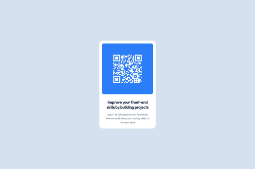
Responsive QR Code Challenge

Solution retrospective
1. What are you most proud of?
I am most proud of successfully implementing a responsive design that adapts seamlessly to various screen sizes, from mobile devices to large monitors. The use of media queries and relative units like percentages and rem allowed me to create a flexible layout without compromising the user experience. Additionally, I was able to maintain the original code structure while adding responsiveness, which shows my ability to work with existing codebases.
2. What would you do differently next time?
Next time, I would focus more on optimizing the performance of the project, especially for mobile devices. For example, I could explore using CSS Grid for more complex layouts or optimizing image sizes to reduce loading times. I would also consider adding more interactive elements, such as animations or hover effects, to enhance the user experience.
3. Where do you need support?
I would appreciate feedback on how to further improve the accessibility of the project, such as ensuring proper contrast ratios and screen reader compatibility. Additionally, I would like to learn more about advanced CSS techniques, like using clip-path or mask-image, to create more visually appealing designs.
1. Responsive Design
- Challenge: Ensuring the layout looked good on both mobile and tablet screens was initially challenging, especially with fixed dimensions in the original design.
- Solution: I used media queries to adjust the layout for different screen sizes. For mobile devices, I switched to relative units like percentages for widths and padding, which made the design more flexible. For tablets, I increased font sizes and adjusted container widths to better utilize the available space.
2. Text Alignment and Line Breaks
- Challenge: The text wasn't breaking correctly on smaller screens, and the alignment didn't match the design in some cases.
- Solution: I used
<br>tags to control line breaks in the HTML and adjusted theline-heightandtext-alignproperties in the CSS to ensure the text was properly aligned and readable on all devices.
3. Maintaining Code Consistency
- Challenge: Adding responsiveness without altering the original code structure was tricky, as I wanted to keep the code clean and maintainable.
- Solution: I kept the original CSS intact and added media queries at the end of the file. This approach allowed me to introduce responsiveness without disrupting the existing styles.
4. Testing Across Devices
- Challenge: Testing the design on multiple devices and screen sizes to ensure consistency was time-consuming.
- Solution: I used browser developer tools (like Chrome DevTools) to simulate different screen sizes and made adjustments based on the results. This helped me quickly identify and fix issues without needing physical devices.
5. Performance Optimization
- Challenge: I was concerned about the performance of the QR code image on slower networks or devices.
- Solution: Although I didn't implement it in this project, I researched using responsive images with
srcsetto serve optimized images based on the device's screen size and resolution. This is something I plan to implement in future projects.
Please log in to post a comment
Log in with GitHubCommunity feedback
- P@joeleg96
You did a great job of using media queries to ensure that the design was responsive to various screen sizes. The design transitioned seamlessly across various screen sizes. Great job, and I wish you good luck on your Coding Journey.
Marked as helpful - P@Islandstone89
HTML:
-
You don't need to wrap the image in a
<div>. -
The alt text must also say where it leads(the frontendmentor website). A good alt text would be "QR code leading to the Frontend Mentor website."
-
Make sure to include the image! You need to change:
<img src="images/QR.png" alt="qr code" />to
<img src="images/image-qr-code.png" alt="QR code leading to the Frontend Mentor website.">.-
I would change the heading to a
<h2>- a page should only have one<h1>, reserved for the main heading. As this is a card heading, it would likely not be the main heading on a page with several components. -
Do not use
<br>to force text onto a new line. The text should flow naturally, and all styling, including space between elements, should be done in the CSS.
CSS:
-
Make a habit of including a modern CSS Reset at the top of the stylesheet.
-
box-sizing: border-boxshould be set on all elements using the universal selector*:
*,
*::before,
*::after {
  box-sizing: border-box;
}
After doing so, remove
box-sizing: border-boxfrom.containerand.blue-box.-
I recommend adding a bit of
padding, for example16px, on thebody, to ensure the card doesn't touch the edges on small screens. -
On the
body, changeheighttomin-height: 100svh— this way, the content will not be cut off if it grows beneath the viewport. -
Descendant selectors like
.info pincrease specificity, making the styles harder to override. Instead, give elements a class, and use that as the selector. -
Remove all widths and heights in
pxand%. -
Add a
max-widthof around20remon the card, to prevent it from getting too wide on larger screens. -
font-sizemust never be in px. This is a big accessibility issue, as it prevents the font size from scaling with the user's default setting in the browser. Use rem instead. -
Since all of the text should be centered, you only need to set
text-align: centeron the body, and remove it elsewhere. The children will inherit the value. -
Paragraphs have a default value of
font-weight: 400, so there is no need to declare it. -
Remove the
max-widthon the<p>. -
The paragraph text has poor contrast. Inspecting it in DevTools shows a contrast ratio of
3.56, lower than the Web Content Accessibility Guidelines minimum requirement of4.5. -
Remove the
paddingon the image. NB: It's not recommended to use%for properties aswidth,margin,paddingorborder-radius. -
On the image, add
display: block,height: autoandmax-width: 100%- the max-width prevents it from overflowing its container. Without this, an image would overflow if its intrinsic size is wider than the container.max-width: 100%makes the image shrink to fit inside its container. -
As the design doesn't change, there is no need for any media queries. When you do need them, they should be in
remorem, notpx.
-


Join our Discord community
Join thousands of Frontend Mentor community members taking the challenges, sharing resources, helping each other, and chatting about all things front-end!
Join our Discord