Not Found
Not Found
Not Found
Not Found
Not Found
Not Found
Not Found
Not Found
Not Found
Not Found
Not Found
Not Found
Not Found
Not Found
Not Found
Not Found
Not Found
Not Found
Not Found
Not Found

Submitted

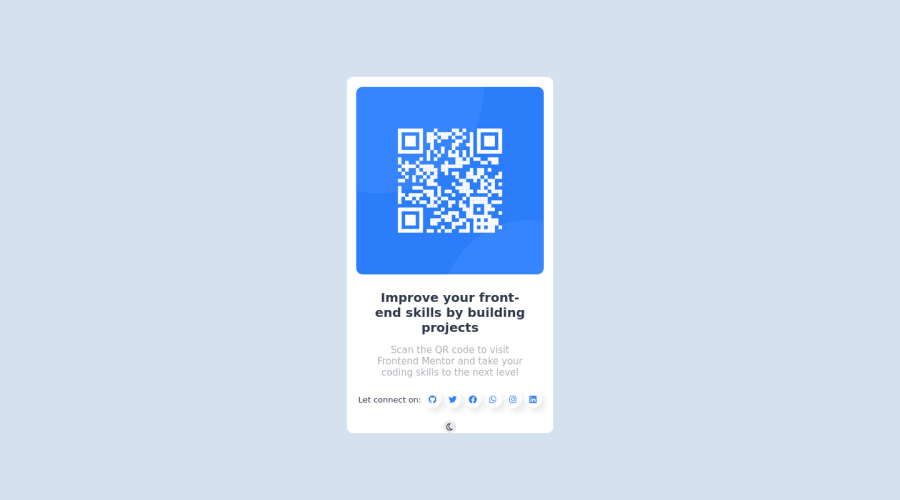
Responsive QR Code Component coded with SCSS JavaScript andHTML

#sass/scss

@Haryorhorlar01

Desktop design screenshot for the QR code component coding challenge

This is a solution for...

  • HTML
  • CSS
1newbie
View challenge

Design comparison


SolutionDesign

Community feedback

Adriano• 34,000

@AdrianoEscarabote

Posted

Hi Haryorhorlar01, how are you?

I really liked the result of your project, but I have some tips that I think you will like:

1- Document should have one main landmark, you could have put all the content inside the main tag click here

2- All page content should be contained by landmarks, you can understand better by clicking here: click here

We have to make sure that all content is contained in a reference region, designated with HTML5 reference elements or ARIA reference regions.

Example:

native HTML5 reference elements:

<body>
    <header>This is the header</header>
    <nav>This is the nav</nav>
    <main>This is the main</main>
    <footer>This is the footer</footer>
</body>

ARIA best practices call for using native HTML5 reference elements instead of ARIA functions whenever possible, but the markup in the following example works:

<body>
     <div role="banner">This is the header</div>
     <div role="navigation">This is the nav</div>
     <div role="main">This is the main</div>
     <div role="contentinfo">This is the footer</div>
</body>

It is a best practice to contain all content, except skip links, in distinct regions such as header, navigation, main, and footer.

Link to read more about: click here

2- Why it Matters

Navigating the web page is far simpler for screen reader users if all of the content splits between one or more high-level sections. Content outside of these sections is difficult to find, and its purpose may be unclear.

HTML has historically lacked some key semantic markers, such as the ability to designate sections of the page as the header, navigation, main content, and footer. Using both HTML5 elements and ARIA landmarks in the same element is considered a best practice, but the future will favor HTML regions as browser support increases.

Rule Description

It is a best practice to ensure that there is only one main landmark to navigate to the primary content of the page and that if the page contains iframe elements, each should either contain no landmarks, or just a single landmark.

Link to read more about: click here

The rest is great!!

Hope it helps...👍

Marked as helpful

0

@Haryorhorlar01

Posted

@AdrianoEscarabote Thanks a bunch for your nice comment and contributions to my task. I must confess that I found every bit of information helpful and would ensure that I do the needful by adjusting my codes to best fit your comments. I'd like to connect with you if you don't mind.

The links on my QR code challenge are active and I hope to learn a lot from you, soon.

Once again thanks for your contributions.

1

@Haryorhorlar01

Posted

@AdrianoEscarabote Could you review my codes again, please? I made use of the main tag.

I look forward to your response soon.

1
Adriano• 34,000

@AdrianoEscarabote

Posted

@Haryorhorlar01 Hi Haryorhorlar01, how are you?

I noticed that your code is better now, congratulations, I only have two more things to say:

1- Every pages needs a <h1> to show which is the most important heading. So replace the <h2> with <h1> and follow the sequence h1-h5

I noticed that in higher resolutions the card was very tall, to fix this we can do the following:

.qr {
    /* height: 83vh; */
    min height: 550px;
}

The rest is really good!!

Marked as helpful

0

@Haryorhorlar01

Posted

@AdrianoEscarabote thanks a bunch for your contribution. I already corrected myself and even added Javascript to toggle the background.

Please review and give me your word.

0
Adriano• 34,000

@AdrianoEscarabote

Posted

@Haryorhorlar01 everything is perfect!!

I really liked the dark mode, congratulations!

I would just change the color of the .qr in darkmode, to make it more visible.

Congratulations on the result

0

@Haryorhorlar01

Posted

@AdrianoEscarabote Hmmm... Could you give me the best colors to use?

Do you do WhatsApp?

0
Travolgi 🍕• 31,500

@denielden

Posted

Hi Haryorhorlar, congratulations on completing the challenge, great job! 😁

Some little tips for optimizing your code:

  • add main tag and wrap the card for improve the Accessibility
  • centering a div with absolute positioning is now deprecated, it uses modern css like flexbox or grid
  • use flexbox to the body to center the card. Read here -> best flex guide
  • after, add min-height: 100vh to body because Flexbox aligns child items to the size of the parent container

Hope this help! Happy coding 😉

Marked as helpful

0

@Haryorhorlar01

Posted

@denielden Thank you so much for your contributions. I found your comments very helpful. I will adjust my code again by wrapping the card with the main tag for accessibility and trying other instructions as stated in your comment. I like to connect with you if you don't mind and would love to learn a lot from you.

All social media on my QR challenge are active. Kindly connect, please.

1
Travolgi 🍕• 31,500

@denielden

Posted

@Haryorhorlar01 You are welcome! Sure, and keep it up :)

Marked as helpful

0

@Haryorhorlar01

Posted

@denielden Could you review my codes again, please? I made use of the main tag and modified my code by removing the absolute for positioning.

I look forward to your response soon.

1
Travolgi 🍕• 31,500

@denielden

Posted

@Haryorhorlar01 Yes, use min-height: 100vh to main tag instead of height, otherwise the content is cut off when the browser height is less than the content and remove all height property from qr class

Marked as helpful

0

@Haryorhorlar01

Posted

@denielden thanks a bunch for your contribution. I already corrected myself and even added Javascript to toggle the theme.

Please review.

1
Travolgi 🍕• 31,500

@denielden

Posted

@Haryorhorlar01 now is much better! good job :)

0
P
Grace• 27,930

@grace-snow

Posted

Hi

As tempting as it is to add extra features, I strongly advise against it on beginner challenges like this. What you’ve added here is some strange UX (it’s not at all how these kind of features would be designed) and all you’ve done is introduce lots of accessibility issues while missing some of the key learning points from the original challenge.

  • alt text is not expansive enough for the image
  • misuse of article and aside
  • aside must be labelled when used
  • scroll disabled, making this whole component cut off and impossible to see on small screens
  • missing heading
  • click targets too small to click and unreadably small
  • links have no content (no labels available to the accessibility api)
  • links have no warning of opening in a new window
  • not at all how you implement a theme changer UI. A single button does not communicate state in any way, and again it is unlabelled
  • font size must never be in px
  • font size is unreadably small
  • overflow is hidden on whole body
  • css is heavily nested, creating css specificity wars that will be in maintainable as you progress to larger projects
  • you’ve worked desktop first instead of mobile first. And no need for any media query on this anyway
  • explicit heights must never be set on components like cards
  • tbh there’s just loads of unnecessary css and poorly performing approaches in there (strange % widths, negative margins, !important, lots of small overrides in media queries…)

I recommend you remove all the extras added in this, focus on getting the original challenge right, then progress through other challenges where you will build up all the important foundations you’re missing progressively. That’s how these challenges are designed to work, it’s important not to jump ahead when html and css essentials are missing

2

Please log in to post a comment

Log in with GitHub
Discord logo

Join our Discord community

Join thousands of Frontend Mentor community members taking the challenges, sharing resources, helping each other, and chatting about all things front-end!

Join our Discord