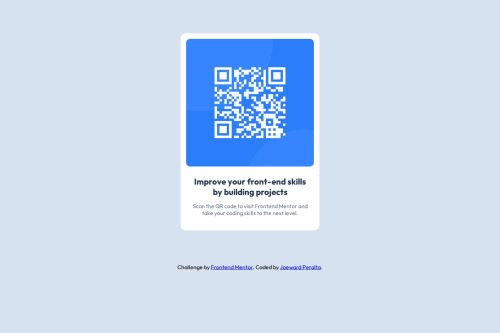
Responsive QR code component page using HTML and CSS

Solution retrospective
One thing I’m most proud of is building the card component. It was very satisfying to design its structure while incorporating web accessibility standards, ensuring that each piece of content conveyed the correct meaning and purpose. Through this process, I enhanced my CSS skills by identifying reusable styles, documenting each section for clarity, and using media queries to create a responsive layout.
If I were to do it again, I would plan the page structure more carefully from the start. Midway through the project, I realized that some elements and styles needed to be added to improve the overall organization. Next time, I would sketch out the page structure beforehand to anticipate potential issues and make more informed decisions.
What challenges did you encounter, and how did you overcome them?One challenge I encountered while building the QR card component was ensuring accessibility and layout consistency across different screen sizes. Initially, the card and footer would break on smaller screens due to element overflow.
To resolve this, I used the browser’s inspect tool to identify which styles were causing the overflow and removed or adjusted them accordingly. I also implemented a more reliable layout using Flexbox to center the component on the screen, which significantly improved both readability and accessibility.
This experience taught me the value of planning the page structure and responsive layout early in the development process to avoid rework and improve the user experience across devices.
What specific areas of your project would you like help with?One specific area I’d like help with is planning and structuring responsive layouts more effectively from the start. While I was able to fix layout issues using Flexbox and the inspect tool, I often found myself adjusting things after seeing them break on smaller screens. I’d appreciate guidance on how to plan mobile-first or scalable designs early in the process to avoid this trial-and-error approach.
Please log in to post a comment
Log in with GitHubCommunity feedback
No feedback yet. Be the first to give feedback on Joeward Peralta's solution.
Join our Discord community
Join thousands of Frontend Mentor community members taking the challenges, sharing resources, helping each other, and chatting about all things front-end!
Join our Discord