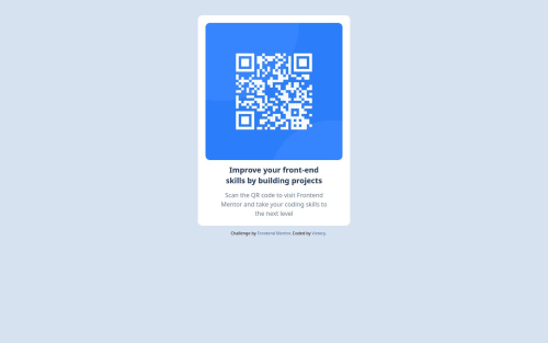
Responsive QR Code Component Page Using Tailwind

Solution retrospective
I'm proud of using Tailwind CSS for the first time on an actual project. It was exciting to explore utility-first styling, and it helped me write cleaner and more structured HTML without relying on a separate CSS file.
Next time, I plan to make the component fully responsive using Tailwind's built-in responsive classes, rather than writing traditional media queries. This will help me practice using Tailwind breakpoints and build more scalable designs.
What challenges did you encounter, and how did you overcome them?The main challenge I faced was maneuvering my way through Tailwind CSS. Since I was new to the utility-first approach, it took some time to understand how to translate traditional CSS techniques into Tailwind classes.
I overcame this by:
-
Frequently referring to the Tailwind CSS documentation
-
Looking at code examples from the Frontend Mentor community
-
Breaking down each UI section and styling it step-by-step with Tailwind utilities
-
Make a site fully responsive using Tailwind CSS breakpoints (e.g., sm:, md:, lg:)
-
Create a better layout structure that adapts cleanly across different screen sizes
-
Improve accessibility and semantics while using Tailwind classes
Please log in to post a comment
Log in with GitHubCommunity feedback
No feedback yet. Be the first to give feedback on codewthv's solution.
Join our Discord community
Join thousands of Frontend Mentor community members taking the challenges, sharing resources, helping each other, and chatting about all things front-end!
Join our Discord