Skip to content
  • Unlock Pro
  • Log in with GitHub
Solution
Submitted over 1 year ago

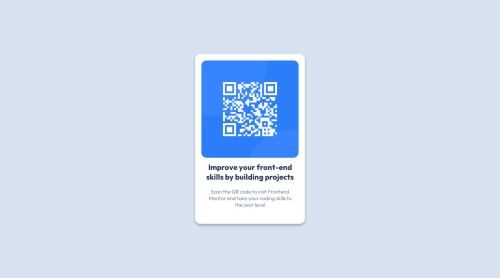
Responsive QR code component using html & CSS.

Talha Asre•10
@talhaasre
A solution to the QR code component challenge
View live sitePreview (opens in new tab)View codeCode (opens in new tab)

Solution retrospective


I didn't face any difficulties during this project. I normally use em values is css but here I've used static px values so that might be a problem sometime in much lower width devices. Yes, I would like to know best possible solution for this challenge.

Code
Select a file

Please log in to post a comment

Log in with GitHub

Community feedback

  • P
    Øystein Håberg•13,260
    @Islandstone89
    Posted over 1 year ago

    HTML:

    • You need a <main>, this is important for accessibility. Change <article to a <main>.

    • The alt text also needs to say where it leads (frontendmentor.io).

    • I would change the structure a little. Change <section class="qr-background">to <div class="qr-box">. That's the only wrapping element you need. You don't need one div for the card background, and another div for the card content.

    CSS:

    • Performance-wise, it's better to link fonts in the <head> of the HTML then using @import.

    • It's good practice to include a CSS Reset at the top. You especially need to add box-sizing: border-box to *

    • Font-size must never be in px. Use rem instead..

    • Remove height: 100% on the image. Change width: 100% into max-width: 100%, and add display: block. This is included in the CSS Reset.

    • Remove display: blockon the card - it already a block element by default

    display: flex;
    justify-content: center;
    align-items: center;
    min-height: 100vh
    font-family: var(--outfit);
    text-align: center;
    

    should all be moved to the body.

    • max-width on the card should be in rem. Around 20rem will work fine.

    • Remove width on the image, change max-width to 100%, and add display: block.

    • Remove max-width on .title and .description. Instead, use padding-inline.

  • Ricky•460
    @rickyxyz
    Posted over 1 year ago

    I'm a beginner myself, so you might want to take this with a grain of salt 🧂.

    Maybe you could try making responsive font size and styling the elements using rem based on the responsive font size. Also, just as a suggestion, you might want to look at the most common screen size being used right now, so you can determine how small or how large of a screen you should accomodate.

    Cheers 🍻.

Join our Discord community

Join thousands of Frontend Mentor community members taking the challenges, sharing resources, helping each other, and chatting about all things front-end!

Join our Discord
Frontend Mentor logo

Stay up to datewith new challenges, featured solutions, selected articles, and our latest news

Frontend Mentor

  • Unlock Pro
  • Contact us
  • FAQs
  • Become a partner

Explore

  • Learning paths
  • Challenges
  • Solutions
  • Articles

Community

  • Discord
  • Guidelines

For companies

  • Hire developers
  • Train developers
© Frontend Mentor 2019 - 2025
  • Terms
  • Cookie Policy
  • Privacy Policy
  • License

Oops! 😬

You need to be logged in before you can do that.

Log in with GitHub

Oops! 😬

You need to be logged in before you can do that.

Log in with GitHub

How does the accessibility report work?

When a solution is submitted, we use axe-core to run an automated audit of your code.

This picks out common accessibility issues like not using semantic HTML and not having proper heading hierarchies, among others.

This automated audit is fairly surface level, so we encourage to you review the project and code in more detail with accessibility best practices in mind.

How does the CSS report work?

When a solution is submitted, we use stylelint to run an automated check on the CSS code.

We've added some of our own linting rules based on recommended best practices. These rules are prefixed with frontend-mentor/ which you'll see at the top of each issue in the report.

The report will audit all CSS, SCSS and Less files in your repository.

How does the HTML validation report work?

When a solution is submitted, we use html-validate to run an automated check on the HTML code.

The report picks out common HTML issues such as not using headings within section elements and incorrect nesting of elements, among others.

Note that the report can pick up “invalid” attributes, which some frameworks automatically add to the HTML. These attributes are crucial for how the frameworks function, although they’re technically not valid HTML. As such, some projects can show up with many HTML validation errors, which are benign and are a necessary part of the framework.

How does the JavaScript validation report work?

When a solution is submitted, we use eslint to run an automated check on the JavaScript code.

The report picks out common JavaScript issues such as not using semicolons and using var instead of let or const, among others.

The report will audit all JS and JSX files in your repository. We currently do not support Typescript or other frontend frameworks.

Oops! 😬

You need to be logged in before you can do that.

Log in with GitHub

Oops! 😬

You need to be logged in before you can do that.

Log in with GitHub