


It has nothing to do with using rem. As you're supposed to be using them when you want to make things responsive.
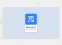
This seams to me to be the culprit: width: 17svw; on your #qr. Which on smaller screens you give a 75vw. This means on tablets and smartphones, the qr will take up about 75% of the screen width. But on desktops, it will shrink down to 17%.
What you need to do here is, give your div id='qr' a max-width. There is various ways you could write this, but an example could be:
* {
	box-sizing: border-box;
	margin: 0;
	padding: 0;
}

#qr {
	width: 95vw;
	max-width: 350px;
	margin: 0 auto;
}
Here we tell the div you need to be 95% of the viewport, until your maximum 350px wide.
Are you familiar yet with how the box-model works in css? CSS Box Model And what the purpose is of this code I added:
* {
	box-sizing: border-box;
	margin: 0;
	padding: 0;
}
Also, don't use div to write headings or text. There are html-tags especially for text. HTML Text Formatting
Marked as helpful
@markvarga21
Posted
@graficdoctor Thank you very much! :D
