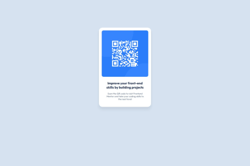
Responsive QR code site using CSS Flexbox

Solution retrospective
I'm quite proud of how the finished project looks similar to the design challenge.
Next time, I'll try to make it look exactly as it should.
What challenges did you encounter, and how did you overcome them?I'm a bit confused when choosing display value for wrapping/layouting the contents. Block, flex, or grid, not sure which one to use.
So I did some research about those values, and finally I decided to use flex. Because it seems easier for layouting columns or rows.
What specific areas of your project would you like help with?So I actually set the paragraph size to 13px and not 15px like how the style guide told me to do.
Because when I try to use 15px, it makes the paragraph look bigger than the heading and I have no idea why.
Here is my HTML code:
<section>
        <div class="qr-code">
            <img src="./qr-code-component-main/images/image-qr-code.png" alt="QR Code" width="100" height="100">
        </div>
        <div class="text">
            <h3>Improve your front-end skills by building projects</h3>
            <p>Scan the QR code to visit Frontend Mentor and take your coding skills to the next level</p>
        </div>
</section>
And here is my CSS code:
.text {
    text-align: center;
    margin-inline: 1.2rem;
    margin-block: 1.3rem;
}

h3 {
    color: var(--slate-900);
    margin-bottom: 1rem;
}

p {
    font-size: 13px;
    color: var(--slate-500);
}
Please log in to post a comment
Log in with GitHubCommunity feedback
- @MarziaJalili
Welcome! Algorithms reign supreme here! 🎉🥳🎉
🤔 The reason you're encountering the font size issue is because the designer wanted you to use the <h1> element, which by default has a larger font size than the <h3> element, and therefore, you don't get the intended match! 😳
🌟 But a quick win for responsiveness?
✅ Using pixels for font size is not a good idea because it doesn’t adjust well on different screen sizes or when users zoom in.
✅ It's better to use units like em or rem so the text can resize more easily and stay readable.
✅ Here you go with an example:
p {
  /* Instead of this...*/
  font-size: 16px;

  /* Try this...*/
  font-size: 1rem;
}
So you could take that num in pixels and divide it by 16 to get the rem value, using calculator of course. 😅
Well-played overall — keep being awesome! 😎🔥🥇
Marked as helpful

Join our Discord community
Join thousands of Frontend Mentor community members taking the challenges, sharing resources, helping each other, and chatting about all things front-end!
Join our Discord