Skip to content
  • Unlock Pro
  • Log in with GitHub
Solution
Submitted about 2 years ago

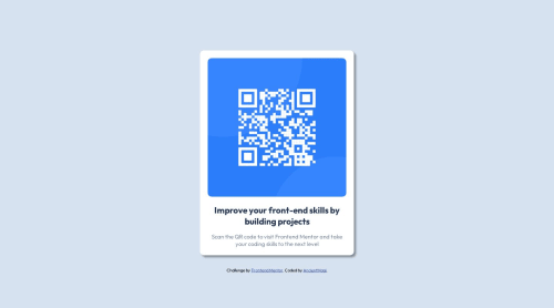
Responsive QR code using flex box

siavashgholami•60
@siavashgholami
A solution to the QR code component challenge
View live sitePreview (opens in new tab)View codeCode (opens in new tab)

Solution retrospective


is the box shadow correct? what about the widths and heights? not working in mobile landscape and its not centered in mobile screen

Code
Select a file

Please log in to post a comment

Log in with GitHub

Community feedback

  • d8701a•240
    @d8701a
    Posted about 2 years ago

    Hello and congrats for completing this challenge!

    Now to answer your questions, you did add a box-shadow and that's completely fine, as a matter of fact your version looks more polished, and I like it. I don't think, however, that you needed to add box-shadow property at all, I believe this card doesn't have it set, but in the end, it really is a matter of preference, not a mistake. You can simply remove it or decide to keep it, both ways are fine.

    When it comes to centering the image in the mobile view, it's probably due to margins and padding. I can see in your code that you used the mobile-first approach, and that's commendable. So you set a media query for screens larger than 400px where you change the width of the container, but you didn't change all the paddings and margins. Usually, when we resize the size of a container/wrapper, margins and paddings need to be adjusted as well.

    Also if you want to have better control of images, make them responsive etc., you can try wrapping them inside a .div, setting dimensions on that .div and then just telling the img to take the whole width of that .div. Like this:

    <div class = "image__container"> <img>your image goes here</img> </div>

    And in CSS:

    .div { width: 420px; height: auto;

    img { width: 100%; height: auto; (if you want an image to preserve an aspect ratio) object-fit: cover}

    This way you are telling the img to take 100% of its parent container, which is the .div container and it's width will be 420px. In case you decided to set the width of your image to 50%, then it would take only 50% of 420px. It makes images responsive and easier to manipulate.

    Also by limiting the container size, your image for this project would've been smaller.

    Other than that, I see you are already familiar and comfortable using custom properties/variables and rems as relative units which is awesome! Keep up the good work and just keep on learning!

Join our Discord community

Join thousands of Frontend Mentor community members taking the challenges, sharing resources, helping each other, and chatting about all things front-end!

Join our Discord

Stay up to datewith new challenges, featured solutions, selected articles, and our latest news

Frontend Mentor

  • Unlock Pro
  • Contact us
  • FAQs
  • Become a partner

Explore

  • Learning paths
  • Challenges
  • Solutions
  • Articles

Community

  • Discord
  • Guidelines

For companies

  • Hire developers
  • Train developers
© Frontend Mentor 2019 - 2025
  • Terms
  • Cookie Policy
  • Privacy Policy
  • License

Oops! 😬

You need to be logged in before you can do that.

Log in with GitHub

Oops! 😬

You need to be logged in before you can do that.

Log in with GitHub

How does the accessibility report work?

When a solution is submitted, we use axe-core to run an automated audit of your code.

This picks out common accessibility issues like not using semantic HTML and not having proper heading hierarchies, among others.

This automated audit is fairly surface level, so we encourage to you review the project and code in more detail with accessibility best practices in mind.

How does the CSS report work?

When a solution is submitted, we use stylelint to run an automated check on the CSS code.

We've added some of our own linting rules based on recommended best practices. These rules are prefixed with frontend-mentor/ which you'll see at the top of each issue in the report.

The report will audit all CSS, SCSS and Less files in your repository.

How does the HTML validation report work?

When a solution is submitted, we use html-validate to run an automated check on the HTML code.

The report picks out common HTML issues such as not using headings within section elements and incorrect nesting of elements, among others.

Note that the report can pick up “invalid” attributes, which some frameworks automatically add to the HTML. These attributes are crucial for how the frameworks function, although they’re technically not valid HTML. As such, some projects can show up with many HTML validation errors, which are benign and are a necessary part of the framework.

How does the JavaScript validation report work?

When a solution is submitted, we use eslint to run an automated check on the JavaScript code.

The report picks out common JavaScript issues such as not using semicolons and using var instead of let or const, among others.

The report will audit all JS and JSX files in your repository. We currently do not support Typescript or other frontend frameworks.

Oops! 😬

You need to be logged in before you can do that.

Log in with GitHub