Not Found
Not Found
Not Found
Not Found
Not Found
Not Found
Not Found
Not Found
Not Found
Not Found
Not Found
Not Found
Not Found
Not Found
Not Found
Not Found
Not Found
Not Found
Not Found
Not Found

Submitted

Responsive QR Component in Simple Way

Uzma Khan 70

@Uzmakh

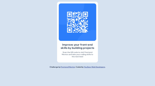
Desktop design screenshot for the QR code component coding challenge

This is a solution for...

  • HTML
  • CSS
1newbie
View challenge

Design comparison


SolutionDesign

Solution retrospective


How can I make it responsive other than a media query?

Community feedback

Abdul Khalid 69,240

@0xabdulkhalid

Posted

Hello there 👋. Congratulations on successfully completing the challenge! 🎉

  • I have other recommendations regarding your code that I believe will be of great interest to you.

CSS 🎨:

  • Looks like the component has not been centered properly. So let me explain, How you can easily center the component without using margin or padding.
  • We don't need to use margin and padding to center the component both horizontally & vertically. Because using margin or padding will not dynamical centers our component at all states
  • To properly center the component in the page, you should use Flexbox or Grid layout. You can read more about centering in CSS here 📚.
  • For this demonstration we use css Grid to center the component.
body {
min-height: 100vh;
display: grid;
place-items: center;
}
  • Now remove these styles, after removing you can able to see the changes
.card {
margin: 1rem auto;
}
  • Now your component has been properly centered

.

I hope you find this helpful 😄 Above all, the solution you submitted is great !

Happy coding!

Marked as helpful

0

Uzma Khan 70

@Uzmakh

Posted

@0xAbdulKhalid Thanks for your valuable feedback . I have done it in body as you suggested but I am in confusion Can we use display : grid; in body and flex in the card?

0
Uzma Khan 70

@Uzmakh

Posted

.card { width: 380px; margin: 5rem auto;}

Then may I remove the width also when removing the margin? what's the way in the grid to show card-space grid-template-column?

0

@manjeshrv592

Posted

Responsive without media queries?

You can use max-width on card instead of width. So it will occupy 100% if screen is below 380px.

make sure you add padding to body or section, so your design won't stick to edges of the screen on smaller devices.

Make sure you reduce overall width of the card and align it vertically at center using flexbox. So it will be more inline with the design file.

Marked as helpful

0

Please log in to post a comment

Log in with GitHub
Discord logo

Join our Discord community

Join thousands of Frontend Mentor community members taking the challenges, sharing resources, helping each other, and chatting about all things front-end!

Join our Discord