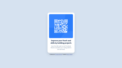
Skip to content
  • Unlock Pro
  • Log in with GitHub
Solution
Submitted about 3 years ago

Responsive QR Component using Flexbox

Sourav Mehra•20
@mehra-sourav
A solution to the QR code component challenge
View live sitePreview (opens in new tab)View codeCode (opens in new tab)

Solution retrospective


  • Should I explicitly define width in .card class or should it be handled by media query (the commented-out code in the end)? What's the best practice?
  1. Am I using too many divs (for header-text and description-text) when I could have used h1 and p for the texts? Or is it just a personal preference?
Code
Select a file

Please log in to post a comment

Log in with GitHub

Community feedback

  • Vanza Setia•27,715
    @vanzasetia
    Posted about 3 years ago

    Hi, Sourav Mehra! 👋

    Congratulations on completing your first Frontend Mentor challenge! 🎉

    Regarding your questions.

    • I would not recommend specifying any width and height on the card element. The card only needs a max-width to prevent it from becoming too large on wide screen sizes. For the height of the card, let the content inside it dictate how much height it should have.
    • In this case, you can finish this challenge without using a single div. In general, you want to use div as a container or a wrapper.

    Now, some feedback from me.

    • The QR code image doesn't need title attribute. The alt attribute is good enough for screenreader users to know what is the image. Also, I recommend improving the alternative text by telling the users the exact use case of the QR code. In this case, it is going to navigate the user to https://www.frontendmentor.io/. So, an alternative text like "QR code to frontendmentor.io" would be great.
    • I recommend using meaningful elements like h1 for the bold text and p element for the other text. It's best to always wrap text content with a meaningful element like a paragraph element whenever possible.

    That's it! Hope you find this useful! 😁

    Marked as helpful
  • Juan Bonilla•610
    @juanpb96
    Posted about 3 years ago

    Hey Sourav 👋

    Good job on this one!

    I think I can help you with your questions and include additional comments:

    • It is good to define width in your .class and you should change it according to what you want with media queries. I recommend starting with a mobile-first approach.
    • You can use different tags to provide a more sematic HTML structure in your code. For example, your <div class="attribution"> should be <footer class="attribution"> or <div class="card"> could be <main class="card">.

    I think it is not a personal preference in general. If you use tags properly, your site increases in accessibility and best practices. You can take a look at HTML reference as it has helped me when I wonder about tags.

    Hope this can be useful for you 😃

    Marked as helpful

Join our Discord community

Join thousands of Frontend Mentor community members taking the challenges, sharing resources, helping each other, and chatting about all things front-end!

Join our Discord

Stay up to datewith new challenges, featured solutions, selected articles, and our latest news

Frontend Mentor

  • Unlock Pro
  • Contact us
  • FAQs
  • Become a partner

Explore

  • Learning paths
  • Challenges
  • Solutions
  • Articles

Community

  • Discord
  • Guidelines

For companies

  • Hire developers
  • Train developers
© Frontend Mentor 2019 - 2025
  • Terms
  • Cookie Policy
  • Privacy Policy
  • License

Oops! 😬

You need to be logged in before you can do that.

Log in with GitHub

Oops! 😬

You need to be logged in before you can do that.

Log in with GitHub

How does the accessibility report work?

When a solution is submitted, we use axe-core to run an automated audit of your code.

This picks out common accessibility issues like not using semantic HTML and not having proper heading hierarchies, among others.

This automated audit is fairly surface level, so we encourage to you review the project and code in more detail with accessibility best practices in mind.

How does the CSS report work?

When a solution is submitted, we use stylelint to run an automated check on the CSS code.

We've added some of our own linting rules based on recommended best practices. These rules are prefixed with frontend-mentor/ which you'll see at the top of each issue in the report.

The report will audit all CSS, SCSS and Less files in your repository.

How does the HTML validation report work?

When a solution is submitted, we use html-validate to run an automated check on the HTML code.

The report picks out common HTML issues such as not using headings within section elements and incorrect nesting of elements, among others.

Note that the report can pick up “invalid” attributes, which some frameworks automatically add to the HTML. These attributes are crucial for how the frameworks function, although they’re technically not valid HTML. As such, some projects can show up with many HTML validation errors, which are benign and are a necessary part of the framework.

How does the JavaScript validation report work?

When a solution is submitted, we use eslint to run an automated check on the JavaScript code.

The report picks out common JavaScript issues such as not using semicolons and using var instead of let or const, among others.

The report will audit all JS and JSX files in your repository. We currently do not support Typescript or other frontend frameworks.

Oops! 😬

You need to be logged in before you can do that.

Log in with GitHub

Oops! 😬

You need to be logged in before you can do that.

Log in with GitHub