Not Found
Not Found
Not Found
Not Found
Not Found
Not Found
Not Found
Not Found
Not Found
Not Found
Not Found
Not Found
Not Found
Not Found
Not Found
Not Found
Not Found
Not Found
Not Found
Not Found

Submitted

Responsive qr-code single page application using HTML and CSS

@keziabaidoo
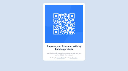
Desktop design screenshot for the QR code component coding challenge

This is a solution for...

  • HTML
  • CSS
1newbie
View challenge

Design comparison


SolutionDesign

Solution retrospective


What are you most proud of, and what would you do differently next time?

I am proud of my ability to design the QR code exactly as it was intended to look. It was challenging, but I could accomplish it with my skills and knowledge. As I continue to work with this technology, I am also interested in exploring other frameworks to enhance my expertise and broaden my knowledge base.

What challenges did you encounter, and how did you overcome them?

I found CSS positioning and alignment challenging, but reading about it gave me a better understanding.

What specific areas of your project would you like help with?

After completing this project, I am excited to seek help and support from the community for future challenges.

Community feedback

P
Grace 27,890

@grace-snow

Posted

I'm afraid this looks very broken on my phone (I'll add a screenshot to discord for you) and has some foundational html errors. I'll go through each improvement in turn and hope it helps :

  • All content should be contained within landmarks. This needs a main to wrap the component and a footer for the attribution. The component can be a section but a section cannot wrap the main and footer. You can place the centering styling on the body.
  • the attribution should not be inside the component.
  • link the fonts from Google fonts and apply in css.
  • the image needs a proper description. I recommend you read the post in the resources channel on discord about how to write good alt text. This particular image needs to say what the image is (QR code) and where it goes (to FrontendMentor.io).
  • the heading should not be a h1. This component would never be used for a page title when placed on a.real.web page. With that context in mind, make this a h2.
  • get into the habit of including a full modern css reset at the start of the styles in every project. Andy Bell or Josh Comeau both have good ones you can look up and use.
  • the component must not have a width. Instead give it a max width in rem. This will allow it to shrink narrower when it needs to, and using rem means the layout will work for all users including those who have a different text size.
  • the component must not have a height at all. Never limit the height of elements that contain text. Let the browser do it's job and decide what height is needed based on the content inside the card.
  • the image only needs a width or max width 100%. It does not need a height. It can optionally include an aspect ratio property abd/or object-fit.
  • keep css selectors as simple and low specificity as possible. Don't chain or nest selectors or you will end up with a maintenance nightmare on larger projects later.
  • Font size must never ever be in px. Extremely important.
  • the content div is completely unnecessary in your solution. Keep html as simple as possible. The text align can go on the component.
  • the component will need a little margin on all sides (or a wrapping element will need a little padding) so it can't hit screen edges.
0
VakhoCloud 120

@VakhoCloud

Posted

Good job.

0

Please log in to post a comment

Log in with GitHub
Discord logo

Join our Discord community

Join thousands of Frontend Mentor community members taking the challenges, sharing resources, helping each other, and chatting about all things front-end!

Join our Discord