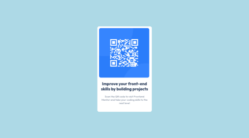
Responsive QR-component with flexbox

Solution retrospective
What would be a better way to practice? Using a css frame work? Would using a grid templete be easier than flexbox?
Please log in to post a comment
Log in with GitHubCommunity feedback
- @aecio-neto
Hi, Lyub's, congratulations on completing the project.
Here are some considerations:
What would be a better way to practice? a) semantic html - you can replace or remove some divs with semantic tags. Such as
mainandarticle. It's a good practice when thinking about SEO.Using css frame work? In such a small application, there is no need. It would be like using a cannon to kill a mosquito.
Would using a grid template be easier than flexbox? It is possible to do the project with both. But flexbox is a better solution as this application is just one column. Grid, helps us create more complex layouts. (multiple columns and rows).
In bigger applications, it is possible to use both (grid and flexbox) to achieve the results we want.
Hope this helps.
- @correlucas
👾Hi @CoolistKovbel, congratulations on your first solution!👋 Welcome to the Frontend Mentor Coding Community!
Great solution and a great start! From what I saw you’re on the right track. I’ve few suggestions for you that you can consider adding to your code:
1.Replace the
<h2>containing the main title with<h1>note that this title is the main heading for this page and every page needs one h1 to show which is the most important heading. Use the sequence h1 h2 h3 h4 h5 to show the hierarchy of your titles in the level of importance, never jump a level.2.Clean your code by removing some unnecessary divs, most of the content can stand alone without a div. Use div only for blocks that need a special alignment or the content needs a special positioning.
3.Use
<main>instead of<div>to wrap the card container. This way you show that this is the main block of content and also replace the div with a semantic tag.4.Use relative units as
remoreminstead ofpxto improve your performance by resizing fonts between different screens and devices. These units are better to make your website more accessible. REM does not just apply to font size, but to all sizes as well.✌️ I hope this helps you and happy coding!


Join our Discord community
Join thousands of Frontend Mentor community members taking the challenges, sharing resources, helping each other, and chatting about all things front-end!
Join our Discord