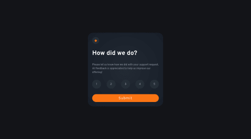
Responsive Rating Card

Solution retrospective
Here are some questions I have:
-
did I do responsive design correctly? I added media queries through Sass on individual elements instead of one big media query.
-
should I have chosen a dynamic width/height for the elements of the rating number?
-
any feedback is welcome!
Please log in to post a comment
Log in with GitHubCommunity feedback
- @FluffyKas
Heyo,
Your solution looks nice! If you allow me though, I have a couple of suggestions:
-
It's not a good idea to define height on most elements (there are exceptions to this, obviously, but in general it's best avoided as it can cause a lot of issues, like unwanted overflow). If you'd like to have some control over spacing, add some padding to them (or margin, when it's applicable).
-
For the little star, it would be best to remove the alt text, it's just a decorative image so it shouldn't be announced by screen readers. You could also add an aria-hidden=true to it. Same goes for the other image (the small machine you see when the form is submitted).
-
It would be more semantic to use checkbox inputs (or the very least buttons, if you can't be bothered with the styling) for the rating numbers.
-
When no rating is selected, you can't press on the submit button. It's great you paid attention to this but it would be nice if there was some sort of visual indicator that the button is disabled and the form cannot be submitted.
-
You have a width: 100% and height: 100vh on the app container. Defining width here isn't necessary, it's 100% by default. The height should be swapped for min-height: 100vh, so it's not locked.
-
You could try using rem instead of pixels. Pixels should mostly be used for setting small details, like box-shadow or border but definitely not widths and font-sizes.
-
Your rating numbers are a little too spaced out in desktop view I think!
The structure of your Sass file seems fine btw! In your personal projects, I believe you could structure it as you please. I also tend to add the media queries to each element individually, it's easier to find things that way ^^
Marked as helpful -
- @alosoft
@Clytax I don't use Sass so I cannot comment on your approach with the media query but I can help make your component responsive when zoomed in and out.
You can start by removing the height and adding a gap to space the children elements out and also set a width in rem to make the rating element to adjust according to the screen size or zoom level
.rating{ width: 30rem; height: unset; gap: 2rem; margin: 1rem; }Marked as helpful - @Clytax
Wow, thanks for the amazing feedback! This is really useful and I will try to change some things immediately! I've heard about not setting heights a lot, but I've never been comfortable with it I think it's just something you have to get used to. And I need to get used to rem too, not so sure about that yet but a little research will do it :)
Thanks again!


Join our Discord community
Join thousands of Frontend Mentor community members taking the challenges, sharing resources, helping each other, and chatting about all things front-end!
Join our Discord