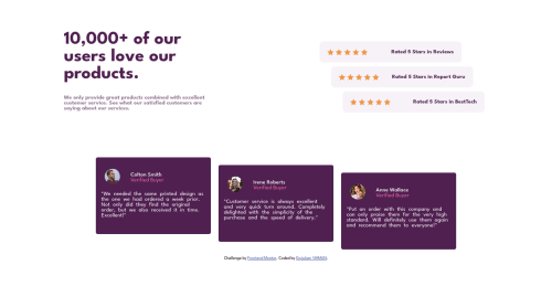
Responsive (Really) Social Proof Section Flexbox

Solution retrospective
Hello everyone! It's me again, with another challenge and questions. I'd like to ask, how do you keep your content responsive for mobile devices? I've tried a few steps, and it's probably because, in desktop sizes, I've given some width and height to the elements, but still is there any shorthand for like limiting the screen size to the contents size or something like that, if you know what I mean :D I've seen something like that. Still, I forgot it now and it's a bit messy around to look for the right content online. I'm having some difficulties from time to time. If there's someone who would like to explain it to me, I'd be very glad to hear him/her. Thanks in advance, have a nice one, everyone!
Please log in to post a comment
Log in with GitHubCommunity feedback
- @SatellitePeace
Hello @dogukan0055 congrats on completing this project
Your project looks great on the big screen but it is not responsive
- To make your work responsive you have to change the direction of your cards and ratings to column because it is not possible for them to fit in a small screen as a row`
#comments{
display: flex;
flex-direction: column;
    justify-content: center;
    align-items: center;
}


@media (min-width:800px) {
#comments{

flex-direction: row;

}
}
Also, do the same for your header section
-
Also using a mobile-first approach which I used in the example above makes it easier for you to create a responsive site
-
Lastly, your CSS is very disorganized which makes it difficult to navigate
-
Your CSS code should have an order like this
-
Google fonts
-
reset CSS
-
root
-
body/ html
-
general styles (for example you may decide that all your p will have the same color so instead of repeating the colour you can do something like this p{ color: #fff; })
-
nav
-
header-
-
main
-
section
-
footer
-
media queries
I Hope This Helps

Join our Discord community
Join thousands of Frontend Mentor community members taking the challenges, sharing resources, helping each other, and chatting about all things front-end!
Join our Discord