
Solution retrospective
This is my first coding exercise since I started learning HTML and CSS. In that context I'm most proud of having been able to code this challenge.
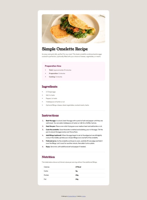
What challenges did you encounter, and how did you overcome them?A challenge I faced was ensuring element naming adhered to accessibility guidelines. Initially, I considered naming headings based on their visual size, such as H1 for "Simple Omelette Recipe," H3 for "Preparation time," and H2 for "Ingredients." However, this approach was not suitable for screen readers. Instead, I prioritized semantic order over size, assigning tags like H2 to maintain a logical hierarchy of information. For example, although "Preparation time" is visually smaller, it represents an essential section of the recipe, warranting an H2 tag.
What specific areas of your project would you like help with?As a beginner, I welcome any feedback on areas for improvement or ways to approach things more effectively and concisely.
Please log in to post a comment
Log in with GitHubCommunity feedback
No feedback yet. Be the first to give feedback on Lyonixa's solution.
Join our Discord community
Join thousands of Frontend Mentor community members taking the challenges, sharing resources, helping each other, and chatting about all things front-end!
Join our Discord