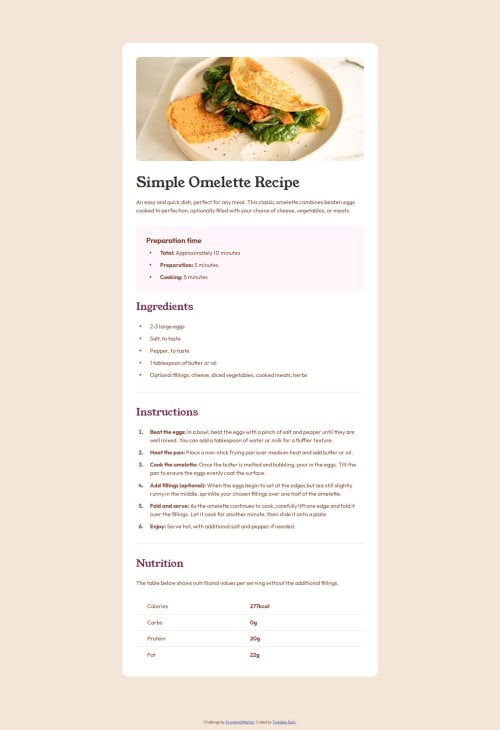
Responsive recipe page; smooth thanks to transitions

Solution retrospective
I managed to incorporate transitions, making each change in the design smooth.
Also managed to stick the image to the top and sides, essentially ignoring padding, without using positioning.
- I would have done this differently if I knew how
- I would have also liked the
transitionto happen only at one spot because when adjusting mobile screen width (on a desktop) the image lags behind the viewport- Probably not that impactful, since mobile width cannot be adjusted in real life, as far as I know
The biggest challenge was properly adjusting the position of the image.
- Solved it with
transform: translateandwidth: 100vw transform: scaleandtransform-origin: bottomdid not work
The other challenge were the bullet points. I noticed that that each bullet point stays vertically in the middle of the text, which is not the case with vanilla unordered list. I had to make custom bullet points and adjust the position with flexbox.
ul > li {
    list-style-type: none;
    display: flex;
    align-items: center;

    &::before {
        content: "\2022";
        font-size: 1.6rem;

        position: relative;
        left: -1.5rem;

        line-height: 0;
    }

    & span {
        display: contents;
    }
}
I could have used padding or margin instead of position but the solution is complete and it works, so there is no need to change it.
If anyone has better ways to solve the problems above, I am happy to listen :)
Please log in to post a comment
Log in with GitHubCommunity feedback
No feedback yet. Be the first to give feedback on Tomislav Šuto's solution.
Join our Discord community
Join thousands of Frontend Mentor community members taking the challenges, sharing resources, helping each other, and chatting about all things front-end!
Join our Discord