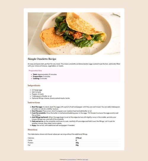
Submitted 10 months agoA solution to the Recipe page challenge
Responsive Recipe page using CSS flex

@vidyaa01
Solution retrospective
What are you most proud of, and what would you do differently next time?
I'm proud of how structured and efficiently I could think and code. Definitely practice makes perfect.
What challenges did you encounter, and how did you overcome them?Following are the challenges I faced:
- Image alignment and fitting it in the recipe card
- Making the page responsive
How did I encounter?
- Made the image margins auto and gave it a max-width
- Studied media query
- When to use % and when to use px, vh etc?
- Is there any standard way where i can learn to write neat code?
Code
Loading...
Please log in to post a comment
Log in with GitHubCommunity feedback
No feedback yet. Be the first to give feedback on vidyaa01's solution.
Join our Discord community
Join thousands of Frontend Mentor community members taking the challenges, sharing resources, helping each other, and chatting about all things front-end!
Join our Discord