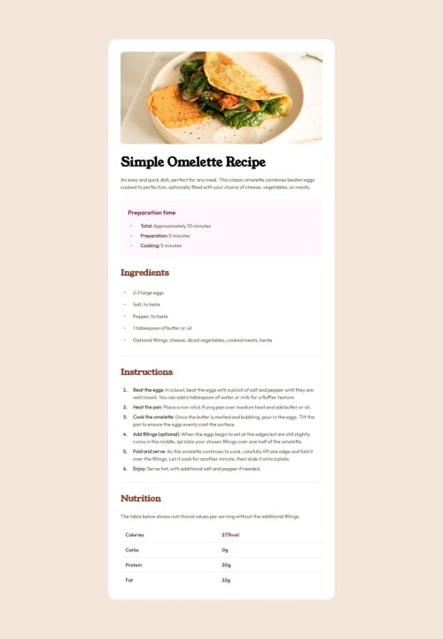
Responsive Recipe Page Using CSS Grid

Solution retrospective
I'm proud of completing the Frontend Mentor Recipe Page Challenge with clean, responsive HTML and CSS code. I successfully implemented custom fonts, CSS variables for scalability, and ensured a polished, accessible design.
In the future, I might explore advanced CSS techniques like animations or transitions to enhance interactivity. Improving the overall performance with optimized image formats and reducing CSS file size could be another focus area. Additionally, I could delve deeper into accessibility improvements, such as better screen reader support or testing with accessibility tools. Incorporating JavaScript functionality for dynamic elements might be another exciting avenue to explore.
What challenges did you encounter, and how did you overcome them?Responsive Design Adjustments: Ensuring the page looked polished across all device sizes, especially handling the layout for smaller screens without compromising on design integrity.
Font Integration Issues: Setting up custom fonts from external sources while ensuring consistency across different browsers.
CSS Optimization: Managing CSS variables and keeping the style sheet concise yet scalable, which required careful planning and testing.
For responsive design, you utilized media queries effectively, focusing on a mobile-first approach and iteratively refining breakpoints.
You debugged font integration issues by double-checking the @font-face syntax and testing across multiple browsers to ensure compatibility.
To optimize CSS, you employed CSS variables for scalable and reusable styles, which helped reduce redundancy and improve maintainability.
Please log in to post a comment
Log in with GitHubCommunity feedback
No feedback yet. Be the first to give feedback on FrontEndExplorer-Temp's solution.
Join our Discord community
Join thousands of Frontend Mentor community members taking the challenges, sharing resources, helping each other, and chatting about all things front-end!
Join our Discord