Skip to content
  • Unlock Pro
  • Log in with GitHub
Solution
Submitted 7 months ago

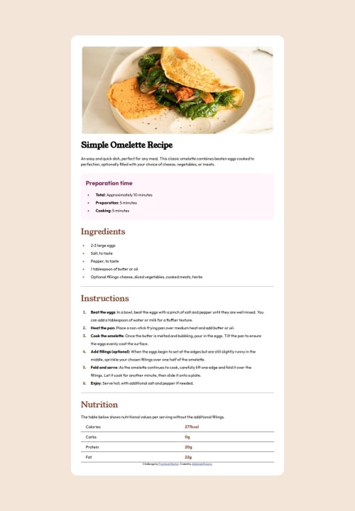
Responsive Recipe page using flex box and media queries

Abhishek1334•40
@Abhishek1334
A solution to the Recipe page challenge
View live sitePreview (opens in new tab)View codeCode (opens in new tab)

Solution retrospective


What are you most proud of, and what would you do differently next time?

I learnt a lot about Css box model and flex box property . I was able to improve my ability to design responsive web pages . I got introduced to Media query.

What challenges did you encounter, and how did you overcome them?

I face some issue with connect the local font files in the project . I used chatgpt to help me so i can remember in future.

What specific areas of your project would you like help with?

Media queries are a bit confusing still. How to make sure a web page is responsive. And how to make sure there is no redundancy in my css code.

Code
Couldn’t fetch repository

Please log in to post a comment

Log in with GitHub

Community feedback

  • Williams Akanni•350
    @shadowbanks
    Posted 6 months ago

    Hello Abhishek, great work on completing the challenge, congrats 🥳

    To make webpage responsive using relative units like em, rem, vw and vh more helps since they scale with screen sizes.

    I noticed in your HTML you had <h1> <strong>Simple Omelette Recipe</strong> </h1>I'd recommend removing the strong and set a font-weight instead (you have the font-weight set already), if you notice your header is thicker than that of the design.

    One last thing, you used a div to wrap the main page content, I'd recommend using semantic tags like main instead, as it improves accessibility and SEO.

    You're doing a good job already keep it up! :))

    Marked as helpful
  • Aakash Verma•9,500
    @skyv26
    Posted 7 months ago

    Understanding Media Queries (min-width & max-width)

    • min-width: Styles apply to screens ≥ specified width. Ideal for larger screens in a mobile-first approach.

      @media (min-width: 600px) {
        body { font-size: 16px; }
      }
      
    • max-width: Styles apply to screens ≤ specified width. Ideal for smaller screens.

      @media (max-width: 600px) {
        body { font-size: 14px; }
      }
      
    • Combined: Target a specific range of screen sizes.

      @media (min-width: 600px) and (max-width: 960px) {
        body { background-color: yellow; }
      }
      
    • Best Practices:

      • Mobile-first: Start with base styles and use min-width for larger screens.
      • Desktop-first: Start with desktop styles and use max-width for smaller screens.

    Efficient media queries create responsive, adaptable designs! 🎯

Join our Discord community

Join thousands of Frontend Mentor community members taking the challenges, sharing resources, helping each other, and chatting about all things front-end!

Join our Discord
Frontend Mentor logo

Stay up to datewith new challenges, featured solutions, selected articles, and our latest news

Frontend Mentor

  • Unlock Pro
  • Contact us
  • FAQs
  • Become a partner

Explore

  • Learning paths
  • Challenges
  • Solutions
  • Articles

Community

  • Discord
  • Guidelines

For companies

  • Hire developers
  • Train developers
© Frontend Mentor 2019 - 2025
  • Terms
  • Cookie Policy
  • Privacy Policy
  • License

Oops! 😬

You need to be logged in before you can do that.

Log in with GitHub

Oops! 😬

You need to be logged in before you can do that.

Log in with GitHub

How does the accessibility report work?

When a solution is submitted, we use axe-core to run an automated audit of your code.

This picks out common accessibility issues like not using semantic HTML and not having proper heading hierarchies, among others.

This automated audit is fairly surface level, so we encourage to you review the project and code in more detail with accessibility best practices in mind.

How does the CSS report work?

When a solution is submitted, we use stylelint to run an automated check on the CSS code.

We've added some of our own linting rules based on recommended best practices. These rules are prefixed with frontend-mentor/ which you'll see at the top of each issue in the report.

The report will audit all CSS, SCSS and Less files in your repository.

How does the HTML validation report work?

When a solution is submitted, we use html-validate to run an automated check on the HTML code.

The report picks out common HTML issues such as not using headings within section elements and incorrect nesting of elements, among others.

Note that the report can pick up “invalid” attributes, which some frameworks automatically add to the HTML. These attributes are crucial for how the frameworks function, although they’re technically not valid HTML. As such, some projects can show up with many HTML validation errors, which are benign and are a necessary part of the framework.

How does the JavaScript validation report work?

When a solution is submitted, we use eslint to run an automated check on the JavaScript code.

The report picks out common JavaScript issues such as not using semicolons and using var instead of let or const, among others.

The report will audit all JS and JSX files in your repository. We currently do not support Typescript or other frontend frameworks.

Oops! 😬

You need to be logged in before you can do that.

Log in with GitHub

Oops! 😬

You need to be logged in before you can do that.

Log in with GitHub