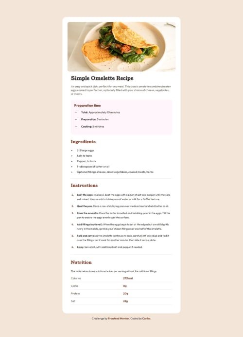
Responsive recipe page using Flexbox and CSS Variables

Solution retrospective
I'm proud of having implemented a responsive layout that closely matches the original design, using semantic HTML, accessibility best practices, and clean use of CSS variables. Next time, I might explore using CSS Grid in some sections, such as the nutrition table, to have more control over responsiveness.
What challenges did you encounter, and how did you overcome them?One challenge was styling the ordered list with properly spaced and colored numbers, which I solved using pseudo-elements combined with ::marker. Another challenge was maintaining visual hierarchy and consistent typography without access to the Figma file, relying only on the style guide and image previews.
What specific areas of your project would you like help with?I'd like to receive feedback on:
- The semantics and structure of my HTML.
- The way I centered the content on the screen.
- The overall accessibility of the page, especially for keyboard navigation.
- Suggestions to improve the responsiveness of the nutrition table.
Please log in to post a comment
Log in with GitHubCommunity feedback
No feedback yet. Be the first to give feedback on Carlos Alberto da Silva's solution.
Join our Discord community
Join thousands of Frontend Mentor community members taking the challenges, sharing resources, helping each other, and chatting about all things front-end!
Join our Discord