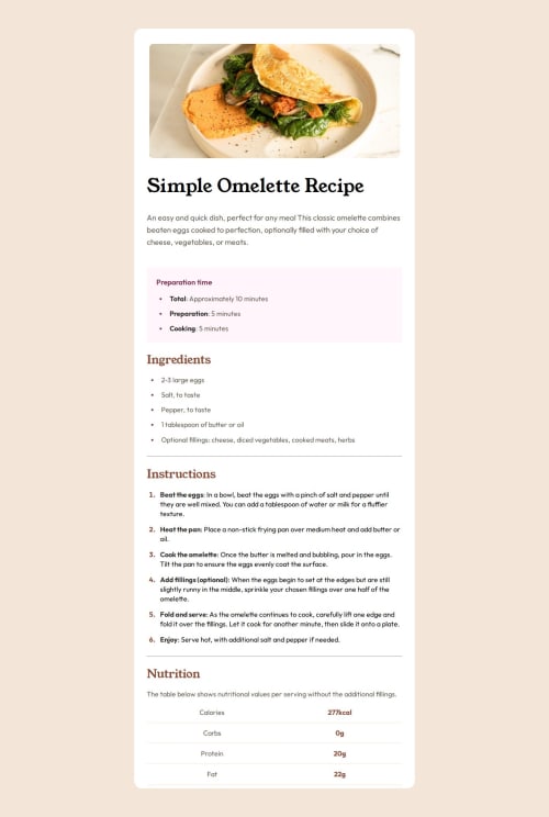
Submitted about 1 month agoA solution to the Recipe page challenge
Responsive recipe page using Flexbox & font-clamp
bem, semantic-ui

@fadymas
Solution retrospective
What are you most proud of, and what would you do differently next time?
I'm proud of how I managed to build a fully responsive layout that looks good on both mobile (375px) and desktop (1440px) using Flexbox, and the clamp() function for fluid typography.
What challenges did you encounter, and how did you overcome them?-Styling custom list items and markers.
-Solution: Applied ::before and ::marker with color and spacing tweaks.
-Making font sizes responsive across breakpoints.
What specific areas of your project would you like help with?-
Feedback on my use of semantic HTML for accessibility.
-
Improvements for media queries and layout fluidity on tablet viewports.
Code
Please log in to post a comment
Log in with GitHubCommunity feedback
No feedback yet. Be the first to give feedback on Fady's solution.
Join our Discord community
Join thousands of Frontend Mentor community members taking the challenges, sharing resources, helping each other, and chatting about all things front-end!
Join our Discord