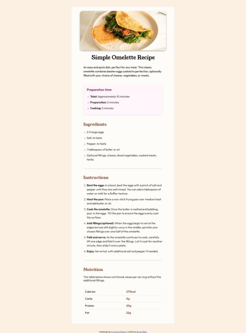
Responsive Recipe Page using Semantic HTML and Flexbox

Solution retrospective
I am most proud of achieving a clean, responsive design that works well on all devices and provides a smooth user experience with CSS transitions. I also ensured good accessibility practices by using semantic HTML and considering WCAG guidelines.
Next time, I would:
- Implement more advanced accessibility features, such as ARIA roles and keyboard navigation.
- Use CSS Grid for more complex layouts and flexibility.
- Add automated accessibility and performance testing.
- Explore using a CSS framework or utility library for faster prototyping.
One of the main challenges was ensuring the image and layout were displayed correctly on GitHub Pages, especially with asset paths. I overcame this by using relative paths and verifying the folder structure matched the repository.
Another challenge was creating a responsive design that looked good on both mobile and desktop screens. I used Flexbox, media queries, and a mobile-first workflow to solve this, testing the layout at different breakpoints.
Finally, making transitions smooth when resizing or changing styles required experimenting with CSS transition properties and timing functions until the animations felt natural.
What specific areas of your project would you like help with?- Improving accessibility, especially for users relying on screen readers or keyboard navigation.
- Optimizing the responsive design for more device sizes and aspect ratios.
- Suggestions for better CSS organization or structure for scalability.
- Ideas for adding interactive features or micro-interactions.
- Feedback on code quality, performance, or best practices.
Please log in to post a comment
Log in with GitHubCommunity feedback
No feedback yet. Be the first to give feedback on Rinzet's solution.
Join our Discord community
Join thousands of Frontend Mentor community members taking the challenges, sharing resources, helping each other, and chatting about all things front-end!
Join our Discord