Submitted 8 months agoA solution to the Recipe page challenge
Responsive Recipe Page with HTML and CSS

@Tanya-abi
Solution retrospective
What are you most proud of, and what would you do differently next time?
I am just proud I completed it and managed to learn some new tricks in the process.
What challenges did you encounter, and how did you overcome them?- I struggled with the right measurements since I do not have a figma file.
- I struggled with adding a responsive padding between the picture and top border. I wanted the padding to increase in width when I expand the page but it seems to remain the same.
- In the preparation and Ingridients section, the bullet points are supposed to align-middle to the text, I didn't know how to do that.
I would like help with the areas I struggled with.
Code
Couldn’t fetch repository
Please log in to post a comment
Log in with GitHubCommunity feedback
- @grace-snow
This challenge is mainly an opportunity to get the html right so I'll focus feedback there.
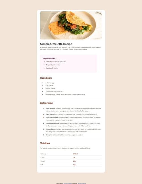
- the omelette image is really important content so needs a proper alt description that communicates the same value as the image. Craig Abbot did a great post about how and when to write alt text if you want to look that up.
- this is really hard to read at the moment because the code indentation isn't neat and consistent. Your code editor can even do this formatting automatically for you with prettier.
- the top content of the recipe is not a header element. There is no benefit to including that as all it's doing is making styling more complex.
- ideally headings should go in order. This should be one h1 followed by h2s (no h3).
- strong is the tag for bold emphasis, not span.
- it's essential in the table to use header cells (th) for header cell content. These cells should also have the
scopeattribute set to "row" to make it clear they are row headers not column headers (which is the default). This whole point is extremely important for accessibility. Without using header cells correctly, the table would break accessibility requirements. - the attribution should be in a footer landmark.
- get into the habit of including a full modern css reset at the start of the styles in every project you do. Look up Andy Bell's modern css reset.
- it is highly unusual to capitalise class names. Really don't do it. It's so well established now that class names are always lowercase.
- I wouldn't expect to ever see a max- height on an element that contains text. That's likely to cause breakage for some users at some point, like if an author changes the amount of text on a recipe, or a user changes their font styles, or someone translates the page into another language. All max- height can do is harm, no benefit.
- I recommend you define media queries in rem or em not px. This is so that the layout adjusts nicely for all users, even those who change their default text size setting.
Marked as helpful - @budijiie
Hello @Tanya-abi, congratulations on completing this challenges
a little advice from me, because I also don't have a figma file, I made my own file in figma by copying the preview file.


Join our Discord community
Join thousands of Frontend Mentor community members taking the challenges, sharing resources, helping each other, and chatting about all things front-end!
Join our Discord