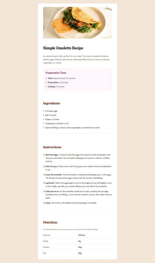
Responsive Recipe Page with Semantic HTML & Modern CSS

Solution retrospective
- Successfully implemented a mobile-first responsive design that scales fluidly across devices.
- Used semantic HTML effectively to improve accessibility and SEO.
- Applied modern CSS techniques like
clamp(), CSS Grid, and Flexbox to maintain consistent rhythm and layout. - Followed the design mockups precisely, ensuring visual accuracy.
- Handled complex layout challenges such as image breakouts and spacing issues smoothly.
- Improved code structure with a BEM-like naming convention, making the CSS maintainable.
What I Would Do Differently Next Time
- Plan the layout breakouts and overflow behavior earlier to avoid late-stage debugging.
- Explore CSS container queries for more adaptive design beyond media queries.
- Automate accessibility testing to catch semantic or ARIA issues sooner.
- Create reusable CSS utility classes for common spacing to reduce repetition.
- Use more CSS custom properties (variables) for colors and spacing for easier theming.
- Write more detailed documentation or comments in CSS for future maintainability.
What challenges did you encounter, and how did you overcome them? Challenges Encountered and How I Overcame Them
-
Image Overflow on Small Screens
Problem: Images were spilling outside the container on mobile.
Solution: Usedwidth: 100vwcombined withmargin-left: calc(50% - 50vw)to make images break out gracefully without causing horizontal scroll. -
Maintaining Consistent Spacing Across Viewports
Problem: Padding and margins looked inconsistent between mobile and desktop.
Solution: Usedclamp()for spacing and font sizes to create smooth, responsive scaling instead of fixed values. -
Semantic Structure Confusion
Problem: Figuring out the best HTML elements to represent complex content sections.
Solution: Followed best practices by usingmain,section,article, and appropriate heading levels (h1,h2,h3) to ensure clear hierarchy and accessibility. -
Unexpected White Space on the Right Side
Problem: Horizontal scroll and whitespace appeared on some breakpoints.
Solution: Debugged container widths and overflow, adjusted margins and padding, and ensured no elements exceeded viewport width. -
Aligning Layout with Design Mockups
Problem: Matching exact padding, font sizes, and colors from designs was tricky.
Solution: Used precise CSS values from the style guide and continuously compared the live build with mockups during development. -
CSS Naming and Architecture for Maintainability
Problem: Avoiding messy or overly generic class names.
Solution: Adopted a BEM-like, component-based naming convention to keep CSS organized and scalable.
What specific areas of your project would you like help with? Areas Where I Would Like Help
-
Optimizing Responsive Typography
I useclamp()andvwunits for fluid scaling, but I want feedback on whether my approach balances readability and performance across all devices effectively. -
Image Breakout Techniques
I’m usingwidth: 100vwand negative margins for images to break out on mobile. Are there more modern or cleaner methods to achieve this without causing layout shifts or overflow? -
CSS Architecture & Naming
I follow a BEM-like naming pattern, but I’d appreciate advice on improving class structure for better scalability and maintainability, especially in larger projects. -
Semantic HTML Validation
Would love feedback on my use of semantic elements (main,section,article, heading hierarchy). Are there improvements I can make to boost accessibility or SEO? -
Handling Edge Cases in Layouts
Any tips on managing tricky responsive edge cases, like avoiding horizontal scroll on complex nested containers or dynamically sized elements? -
Performance Best Practices for CSS
Suggestions on minimizing CSS complexity or improving load/render times without sacrificing design fidelity.
Feel free to review specific snippets or sections of my code if that helps provide more targeted advice!
Please log in to post a comment
Log in with GitHubCommunity feedback
- @MarziaJalili
Flawlessly written! 👑
🌟 A teeny tiny tweak?
✅ You can use the padding shorthand property to update the code below:
padding-block: 0.75rem;
padding-inline: 0;
✅ Updated code:
padding: 0.75rem 0;The code is solid-bulletproof! 🔥🔥🔥
Marked as helpful

Join our Discord community
Join thousands of Frontend Mentor community members taking the challenges, sharing resources, helping each other, and chatting about all things front-end!
Join our Discord