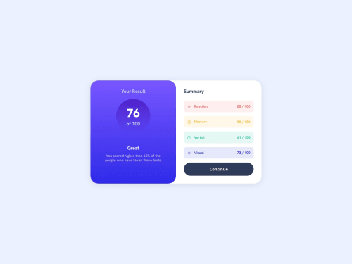
Responsive Result Summary Card with interactive UI and clean design.

Solution retrospective
I’m most proud of creating a clean, responsive UI that looks good on both desktop and mobile screens. The use of CSS variables and flexbox made the layout flexible and maintainable. Next time, I would improve accessibility by adding better keyboard navigation and ARIA labels to make the interface more inclusive.
What challenges did you encounter, and how did you overcome them?One challenge was managing consistent spacing and alignment across different screen sizes. I overcame this by using CSS Flexbox for layout and media queries for responsiveness, which ensured the card adapts well to smaller devices. Another challenge was choosing accessible color contrasts, which I resolved by testing colors with contrast checkers.
What specific areas of your project would you like help with?I’d like feedback on improving accessibility, such as adding keyboard focus styles and ARIA attributes. Also, suggestions on optimizing CSS for better performance and maintainability would be helpful. If there are ways to enhance user interaction or animation without compromising simplicity, I’d appreciate ideas on that too.
Please log in to post a comment
Log in with GitHubCommunity feedback
No feedback yet. Be the first to give feedback on helloamresh's solution.
Join our Discord community
Join thousands of Frontend Mentor community members taking the challenges, sharing resources, helping each other, and chatting about all things front-end!
Join our Discord