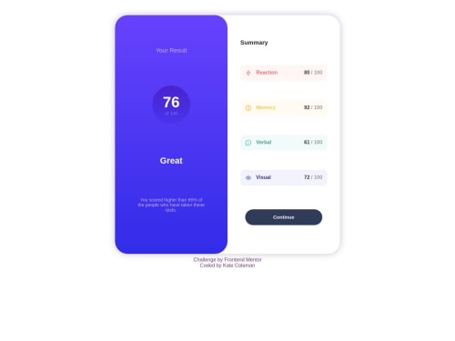
Not Found
Not Found
Not Found
Not Found
Not Found
Not Found
Not Found
Not Found
Not Found
Not Found
Not Found
Not Found
Not Found
Not Found
Not Found
Not Found
Not Found
Not Found
Not Found
Not Found

Submitted

Responsive results and summary page using Flexbox

@tabbycoleman

Desktop design screenshot for the Results summary component coding challenge

This is a solution for...

  • HTML
  • CSS
1newbie
View challenge

Design comparison


SolutionDesign

Solution retrospective


My first challenge!

I think there are a lot of better practices I can learn regarding responsiveness, I'm still not sure how to make it scale nicely and not squash too much before getting to the mobile size.

Community feedback

@LuisJimenez19

Posted

Hello, congratulations on completing the challenge.

The idea of ​​centering the component is very good, if you add min-heigth:100vh; justify-content:center; overflow:hidden; to <body> then the content will be perfectly centered.

Then this time you don't need to use this:

`@media (min-width: 955px) #content-box { max-width: 50%; }``

If you add max-width:700px then it won't get that big, you can give it the width you want as well as the height. Otherwise everything is fine, with practice everything gets better. By the way, it is better to use classes instead of the id if you want to give it styles, it is a convention but it is up to you what to use.

I hope my comment is helpful👋🏽

Marked as helpful

1

@tabbycoleman

Posted

@LuisJimenez19 thank you! This was very helpful

0

Please log in to post a comment

Log in with GitHub
Discord logo

Join our Discord community

Join thousands of Frontend Mentor community members taking the challenges, sharing resources, helping each other, and chatting about all things front-end!

Join our Discord