Submitted over 2 years agoA solution to the Results summary component challenge
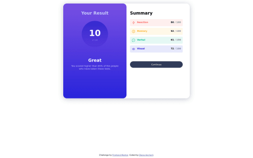
Responsive Results Summary page with CSS

@dianesancheril
Solution retrospective
The most challenging part of this project for me was figuring out how to center all of the content (outermost container) in the desktop layout.
Questions:
- Does anyone have any tips, tricks or resources on how to better understand/practice the placement of divs?
- Are there a list of standard screen sizes we could use with media queries?
- I used float to design the mobile device layout and position for the desktop layout. I was wondering if it would've been easier with flexbox or CSS grids.
Code
Loading...
Please log in to post a comment
Log in with GitHubCommunity feedback
No feedback yet. Be the first to give feedback on DSA's solution.
Join our Discord community
Join thousands of Frontend Mentor community members taking the challenges, sharing resources, helping each other, and chatting about all things front-end!
Join our Discord