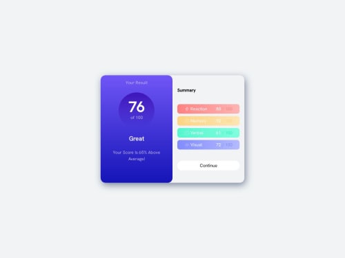
Responsive Results/Summary Component With Dark and Light Mode

Solution retrospective
There are two things i would like feedback on the most -1st: The obvious one: THE CSS IS HORRIBLY BLOATED any suggestions to cut down on even a couple of lines would be greatly appreciated -2nd: The light mode was honestly an afterthought my goal was never to make the light mode look like the provided design, but it just looks worse than the dark mode, specifically in neutral colors (most notably in the (lack of) contrast between the button and the card)
Please log in to post a comment
Log in with GitHubCommunity feedback
No feedback yet. Be the first to give feedback on MhBbid's solution.
Join our Discord community
Join thousands of Frontend Mentor community members taking the challenges, sharing resources, helping each other, and chatting about all things front-end!
Join our Discord