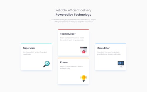
Responsive site built with FlexBox

Solution retrospective
Hey guys, this is my solution for this challenge. I had trouble positioning the icons in the cards and after googling I found a solution but I don't understand why the icons move outside the card when I comment out position: relative in .card. Full code can be found below. Thank You.
 .card {
  width: 100%;
  height: var(--mobile-card-height);
  background-color: white;
  margin-bottom: var(--card-margin-bottom);
  border-radius: 0.5rem;
  padding: 1.4rem;
  position: relative;
  box-shadow: 0px 0.875rem 1.25rem -0.313rem rgba(218, 228, 240, 1);
}

 .card img {
  position: absolute;
  right: 0;
  bottom: 0;
  padding: inherit;
}
Please log in to post a comment
Log in with GitHubCommunity feedback
- @KristinaRadosavljevic
Hi Attrams! Good job on your solution :)
As for your question, when you specify
position: absolute;, the element is positioned in relation to the nearest parent which is also positioned (i.e. which has thepositionproperty set to anything other thanstatic, which is the default). However, if you don't have such an element (which happens when you comment outposition: relative;from.card), then the first parent in the hierarchy (which is<html>I believe) is used as a reference for positioning the icons. You can read up on this all over the internet if you just google 'css position absolute', but I also found this article, which goes into a lot of detail from the beginning so it might be good as a starting point if you want to learn more :)Also, while we're at it, I noticed that the titles and the introductory paragraph are a bit too narrow from screen widths of about 1310px to about 900px, so you might wanna take another look at that.
I hope this helps :)
Marked as helpful

Join our Discord community
Join thousands of Frontend Mentor community members taking the challenges, sharing resources, helping each other, and chatting about all things front-end!
Join our Discord